As we continue to live with this pandemic — spending more time than ever in our homes, especially as this winter chill sets in — I’m starting to hear some common design requests. Previously forgotten or underused areas of the home are making a comeback. The lower level of the home, for instance, is getting a LOT of love these days.
And it makes sense.
If you have an entire floor that has become simply a throw away space for storage, why not put it to good use?
Making your lower level an attractive location within your house will not only boost your home’s value, it will also give you a place to spread out and/or escape. Like when you need to sneak in an impromptu zoom call or simply want a refuge from the kids 😉
So I wanted to share a recent project where we put a big emphasis on the lower level. This is Part Two of the Whitmoor Country Club project, which I revealed in my last blog post.
Lower Level Love
As a refresher, the clients are a couple who were looking to downsize after their son left for school. They bought a home in the perfect setting, right on a golf course, and wanted to make some updates. The goal was to freshen up the interior and have it better suit their lifestyle.
Upstairs, we went with a lighter overall look, with a slightly more formal feel.
But for the lower level, we wanted to take things in a different direction, working in some moodier tones and different textures, and even some sports memorabilia.
This is a space where the couple plans to entertain, once indoor gatherings become safe and fashionable again. So they were envisioning a bigger, open floor plan where ladies could sit and chat while the gents play pool or watch a game. But everyone would be in the same space.
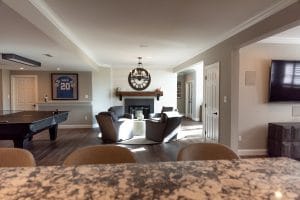
So that was the first thing we tackled. We knocked down some walls and created an open floor plan design that allows several different uses at once. My hope was to create a kind of multi-purpose space, where there are defined areas within the larger room, but everything flows together seamlessly.
Included is a home bar, a sitting area with a fireplace, a pool table, gym area, and an extra bedroom for when their son is home.
Sounds like a lot to fit into one space, doesn’t it?!
Yes and no. By making strategic design moves, we were able to incorporate all of these elements in a way that is cohesive and not at all cramped.
Let’s take a closer look.
Lower Level Details
As you walk down to the lower level, your feet land on a runner in a black and white chevron pattern. I love how this sets the tone for the space you are about to enter. At the bottom of the staircase, we have a console table and accessories from Uttermost. The reclaimed wood table is a perfect accompaniment to the fireplace mantle in the sitting area, which is where your eyes travel next.
So let’s talk about that sitting area, because I really love how it came together!
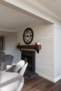
We went with a horizontal white shiplap on the fireplace surround. I like how this helps soften this section of the room, which as I mentioned, will be a place where the women can sit and chat while their husbands do whatever it is that husbands do 🙂
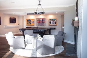
Some light grey armchairs, a white coffee table, and blended white and grey circular rug help complete the look. And the black metal clock above the mantle blends well with the chandelier above.
Note that this sitting space could very easily be swapped onto the first floor somewhere. This was my way of carrying a touch of the first floor design into the lower level. While I wanted this floor to have a different feel, I still wanted it to be cohesive. I think the sitting area helps with that.
Throughout this level, by the way, we installed some darker vinyl plank flooring that contributes to the moodier look we were going for.
Game Day Space
Moving on, let’s talk about where the guys will hang.
There is a pool table right next to the sitting area which offers a shift in look/tone.
Here, I continued the shiplap, as part of my effort to blend different spaces. But I also wanted to give this area its own distinct and more masculine feel.
So we added some framed jerseys on the wall. And I also included a drink rail just below the tv. It’s little functional touches like this that really make a space livable.
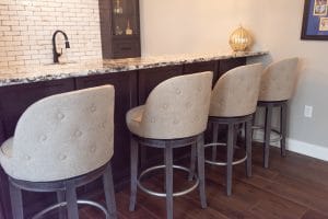
The home bar is a mix of the masculine and feminine styles. The subway tile in a brick set pattern adds some edginess, while the barstools and countertop soften the look.
Basically, I wanted to make this area comfortable for anyone in the group, male or female. I think this blend of styles helps achieve that.
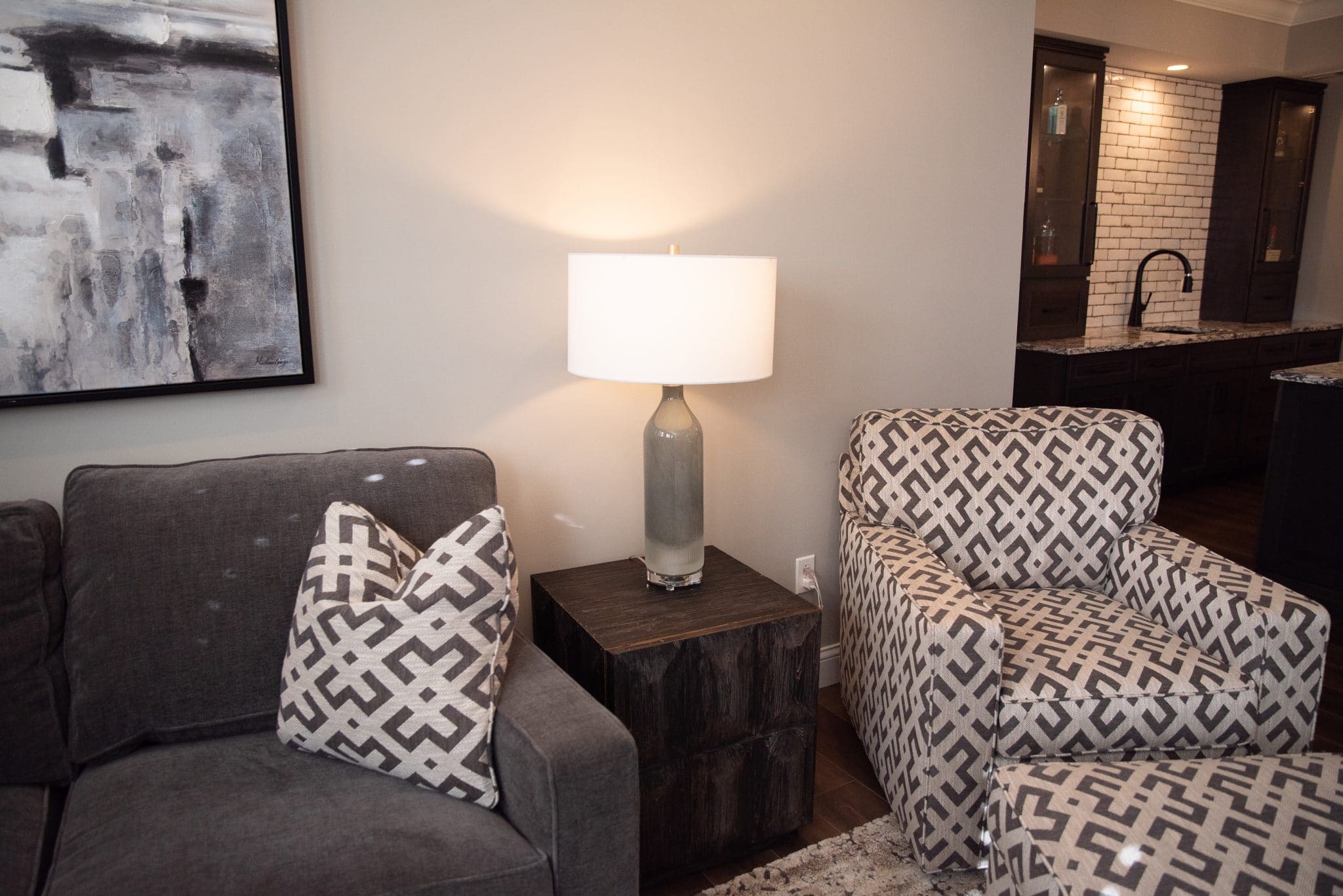
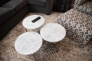
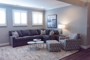
Finally, we have a larger sitting area with a sectional and armchair for tv watching. Here, I had a lot of fun mixing patterns. Between the armchair fabric, throw pillows, and rug, there’s a lot for the eye to take in. But in working with different sized patterns and a consistent color palette, it doesn’t get overwhelming.
One last element that is tucked away from the larger space is the home gym. We kept this room simple. This way, it has future potential as a bedroom, if ever needed. A rubber mat and some exercise equipment is really all you need here, anyway. So that’s what we did!
Stay Tuned
So there you have it! I hope you enjoyed Part Two of this project. And I can’t wait to share additional renos and design projects that I’ve been working on, so keep your eye on this space! As always, please call or email if I can help you with your design needs.

