One of the benefits of working with an interior designer is you can have a truly custom experience. And I mean custom in every sense of the word. You can make your home entirely unique to you, whether it is in the design and layout of the house, or the furniture you choose and the rugs and artwork you display.
Your designer is basically charged with bringing your vision or design tastes to life. And that means pulling out all the stops to make sure you get exactly what you want.
I had a project this past year with a longtime client where we took the home to the next level of custom treatment – as in, total ‘wow’ factor, one-of-a-kind gem! I wanted to share because it was such a fun experience for everyone involved. And the end result is definitely one that I am proud of. But first, some background on the project.
Client Wish List
I handled the design work for this couple when they first built their home in St. Charles about 20 years ago. Now, with the kids all grown and the passage of time, they were hoping I could come back in with fresh eyes.
They had considered buying a new home but soon realized they couldn’t find anything that would measure up to what they already had. So they needed a refresh. And fortunately, they still had me on speed dial 😉
The wife has more contemporary tastes, but the house is more traditional. My task was to modernize, but in such a way that it didn’t clash with the overall feel of the house.
We’d be taking on the project in phases, so anything new couldn’t be such a huge departure from the old that it would feel disjointed.
I should note that I’ve done a few other projects for this couple through the years. I designed their home at the Lake of the Ozarks. And I’ve done work for one of their kids.
So there was an existing relationship there. And that helped significantly when it came to flexing my design muscles. The client put a lot of trust in me to work on all of these custom details, and that level of trust afforded a lot of flexibility. That’s how we were able to achieve all of the custom elements you will see throughout.
Custom Layout
One of the first things we did was look at how the clients had been using the space. Then, I asked them to consider how they wanted to use the space in the future.
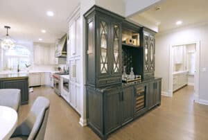
After years of living in the home, the clients realized they were craving a certain something: more storage space, and in particular, more storage space that is conducive to entertaining.
In revisiting, I saw that they had some clear opportunities on that front. And it wouldn’t take a ton of demo work to get there.
Here’s what we did:
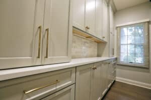
We took a section of the garage and framed it out to create a huge walk-in storage area filled with floor to ceiling cabinetry. This was to be used for spillover dishes and platters and other entertaining items.
We moved the laundry room. And we were able to turn a smaller coat closet into a giant walk-in closet for the first floor primary suite.
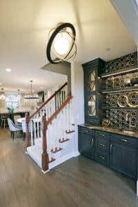
We also added a new butler’s pantry, for crystal, china and other formal items. Then we revamped the existing wet bar to match the style of the new butler’s pantry.
Now, when you walk down the hallway, you see the wet bar and entertaining area as a showcase. You can turn left to head to the master suite, or turn right to enter the beautifully remodeled kitchen (more on that in a bit).
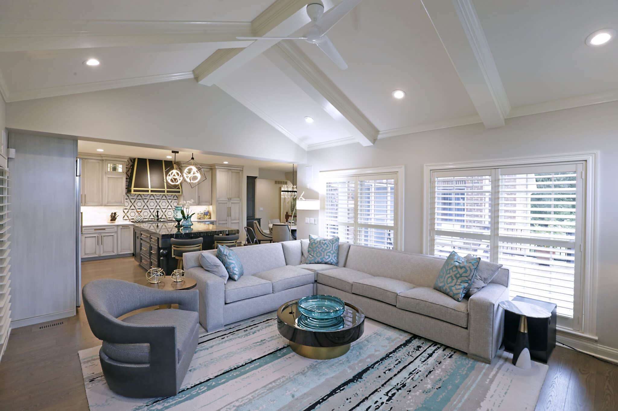
We also switched the kitchen island from an angular piece that disrupted flow, to a more integrated and streamlined rectangular shape.
As far as renovations go, this wasn’t a major, major overhaul. But tweaking the space in smaller ways had a huge impact. In my opinion, the changes made the first floor more functional and breathtaking.
You can’t beat that.
Detailed Design
Now, for what movie and book lovers call a cliff hanger 🙂
I am SO excited to share some of the unique design details that we were able to incorporate throughout this home. But because there were just SO MANY custom touches, I want to make sure I can give each their due attention. So, for now, we’ll run through the kitchen elements.
And in the next blog post, I’ll walk you through some of the nitty gritty fun details throughout the rest of the home.
As I mentioned previously, one of the first things we tackled in the kitchen was changing the shape of the island. We also removed
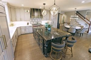
some of the trim around the arched window to brighten the space up. Just those two moves went a long way toward creating a lighter, airier feel.
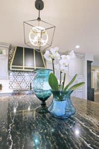
We used a Cambria quartz with a DOUBLE THICK EDGE on the new island. Doesn’t that just ooze glamour?
And I was able to find a custom made steel hood with a brushed gold accent for above the range. Underneath this, we used a carrara marble backsplash with a gold and black inset for some visual interest.
I chose a matching subway tile for the rest of the walls. Then we carried it up to the ceiling for that luxe feel the client was craving. (Proof, by the way, that subway tile doesn’t have to be basic!).
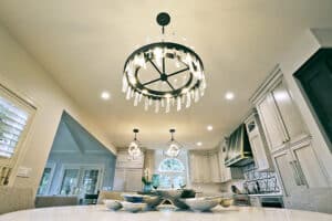
We also added some stunning pendants from Metro Lighting.
Finally, we ordered all new cabinet fronts from Decora and all new appliances from Authorized Appliance in St. Louis. And, because custom was the name of the game here, I hand selected every piece of hardware that you see throughout!
That’s all for now. But as I mentioned, I can’t stop there with just these details. It wouldn’t do the home justice. So stay tuned for the next post where we talk more about this custom project! And in the meantime, please call if you’re interested in having me bring some custom design treatment to your home!
