

There’s nothing better than a good Before and After project!
So, my friends, I couldn’t wait to show you this latest remodel of mine. It has all the wow factors that I strive for in a renovation — improved lighting, better sight lines, increased functionality. But the original character of the home still shines through, which is always a must for me.
The clients, who are from Connecticut, found and hired me through Houzz. They wanted a top to bottom refresh that lightened their look and improved flow, especially in the kitchen and great room area.
The house, in Sunset Hills, had a lot of good things going for it. But my designer’s eye definitely saw some areas where we could make improvements.
Over the course of this job, we not only updated the kitchen and great room, but also installed and refinished their hardwood floors and updated the main bath. I helped them turn their living room into a study that they would use more, including by adding new built-ins and french doors. I also brought in a painter and ordered all new furniture for a more crisp, transitional feel.
So let me walk you through those changes, room by room. I think you’ll enjoy seeing the end result!
Before And After
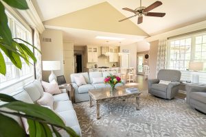
The first thing I noticed on our initial site visit was the client’s kitchen felt unnecessarily closed off from the great room. The kitchen counter jutted out as a sort of peninsula to divide the space. And a smaller island separated the main kitchen area from a cute breakfast nook.
I liked how this allowed a view into both adjacent spaces. But the configuration interrupted the flow between the rooms.
I thought we could come up with something that would further open up the transition space, while also creating a more functional countertop/work space.
The plan I ultimately arrived at is fairly traditional, but innovative given our starting point.
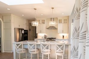
As you can see in these pictures, we tore down the peninsula, along with its adjoining cabinetry.
In its place, I designed a larger kitchen island that includes plenty of key storage space topped by a giant countertop work surface.
This is positioned in such a way that it highlights the beautiful arched entryway to the dining room. And it has room for more countertop seating than the peninsula allowed for.
We were losing some cabinets in making this move, and I had to find a new home for some of the bigger appliances. So I came up with a plan for adding some cabinetry to the end of the appliance wall. It’s not your typical kitchen design, but here, it works well.
Creating a larger island also eliminated the need for the smaller island near the breakfast nook. So I removed that as well, and now we have this wonderful sight line that runs from the dining room to the breakfast nook.
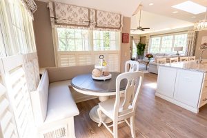
This nook, by the way, is now my favorite part of the room. Its corner location made it ideal for some bench seating, which I was excited to install. Not only is bench seating popular right now — it is also so cozy and family-friendly!
Finally, in this room, as in the rest of the remodel, I lightened things up with paint and textiles.
We moved from darker brown cabinets to a smooth and creamy white. The backsplash is a crisp and clean subway tile. And the countertops and window coverings work to blend the white with the taupe-toned walls.
Some newer light fixtures perfectly complement the skylights, which draw in a flood of natural light.
It is really night and day when you look at this kitchen transformation. The clients were ecstatic with this Before and After. And that is one of the most rewarding aspects of my job!
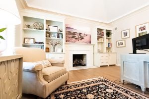
Fireplace as a Focal Point
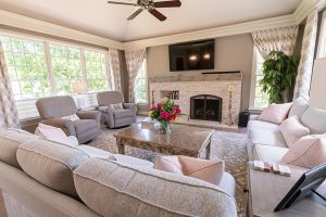
Moving on to the great room, I wanted to bring your attention to my absolute favorite element of this remodel. Just check out that fireplace surround!
Previously, the hearth was a large expanse of traditional brick, with a built-in cubby/cabinet to the left of the fireplace opening.
This was probably quite appealing when the house was first constructed, but it now felt a little dated. And the size of the surround only served to exacerbate that issue.
The way I see it, if you are going to dedicate almost an entire wall to a fireplace, you want to make sure it makes the right kind of statement. Current, cozy and slightly coastal is the vibe I was seeking.
So I advocated for some changes.
I found a beautiful, creamy stone to replace the brick. And then we installed a mantel that stretches the length of the fireplace. It resembles a large piece of polished driftwood, plucked straight from a beach — just perfect for the look I was going for!
We removed the cabinet/cubby and instead used that space for some built-in shelves/ledges for stacked firewood (or, in this case, reading materials!).
Voila! A once-dated fireplace is now the perfect focal point for this room.
For the rest of the space, I replaced a color scheme of reds, browns and muted greens with a more calming palette of neutrals. The rug offered another chance to blend taupe with a creamy white, and the two loveseats are a soothing blue.
The coffee table has a weathered look that pairs well with the fireplace mantel. And I carried the window coverings from the kitchen through to this room for continuity.
From Green to Serene
The living room turned study offered another opportunity for some updates.
Previously, this room was painted and decorated in a sort of olive green, which over time had taken on a dull look.
Like in the great room, the fireplace was in that same traditional brick and had that same white cubby accompanying it.
The clients were also seeking to turn this space into a study, which would hold more use for them.
I immediately saw the potential for a great Before and After.
Once again, the fireplace transformation is striking, if I do say so myself.
Out went the old brick and in came a beautiful chevron patterned stone, with a creamy white wood surround.
I then added some built-ins on both sides of the hearth to improve the utility of the space.
An L-shaped desk space fit perfectly here, and the new french doors helped elevate the space.
As a final touch, I added a beautiful painting of a beach scene above the mantel. So serene! Who wouldn’t want to work from home in this space?!
The Main Suite: Before and After
Last but not least, we have the main bedroom and bath.
As with the rest of the house, this started as a darker space, with richer woods and a lot of heavier paint colors and textiles.
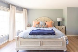
I wanted to lighten it up, so we brought in a soothing blue for the walls and then added some pops of texture and color with the throw pillows and rug.
The furniture again takes on that weathered look, and the creamy white arm chairs and curtains round everything out.
In the bathroom, brown cabinets became white cabinets. And I removed a center tower that dated the look, replacing it with a third stand alone mirror. I also switched out the above-mirror lighting in favor of some elegant sconces.
The shower area stayed pretty much the same, because I thought it worked with the space. If it ain’t broke, don’t fix it!
Can I Help With Your Remodel?
So there you have it! I hope you enjoyed the virtual tour. And I hope this project helps illustrate how an interior designer can really help elevate a space, even without major, major changes. As always, I am available to answer your design questions and eager to take on new projects. So please give me a call or reach out via my contact page!