 Interior design is part art and part science, and that is never more true than when we are working on a renovation.
Remodeling is in many ways a more complex process than starting fresh with the blank slate of new construction.
When I am renovating a space, I have several goals in mind. First, I aim to freshen the space up, in a way that it is both current AND timeless.
Second, I want to design something that has universal appeal but also meets the unique tastes of the homeowner.
Third, I need to consider the practical constraints and distinct qualities of the existing space and structure.
One recent project I worked on demonstrates these three ideas very well.
The homeowners were looking for a renovation of their home of 17 years, which previously belonged to the husband’s parents.
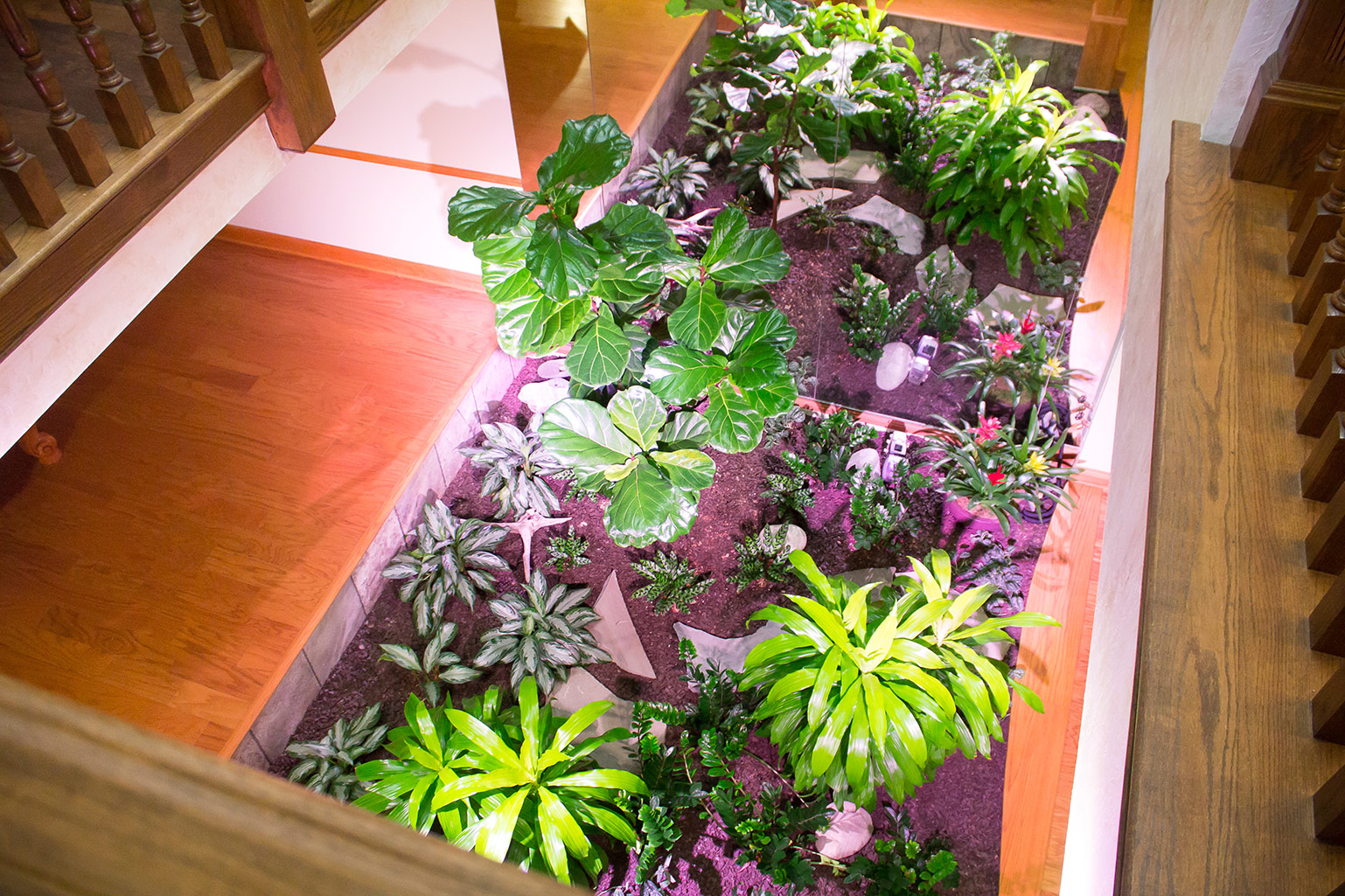
As you will see in the included pictures, the house itself carries a lot of charm and character, from the two-story atrium that separates the dining room from the great room, to the carved columns and millwork that grace several rooms.
But the homeowners wanted to freshen up the decor, and also play with the floor plan a bit to open up the kitchen and master bath in particular.
The design theme I settled on is quite unique, blending the more traditional, lodge-like characteristics of the home with a glamorous, textile rich ambience.
Let me walk you through some of the rooms and you’ll see what I mean.
Reconfiguring Rooms for Function and Style
This couple loves to cook and entertain, so one of our main objectives was to expand the kitchen — not only functionally, but with a more open appearance too.
We accomplished this by completely refiguring the way the laundry room and powder room connect to the kitchen.
The former powder room was fairly expansive.
Wh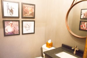 ile it can be a luxury to have an extra large powder room, it is not really practical — especially if you can use that space elsewhere. And the old laundry room took up space that I knew would be optimal for an expanded kitchen.
So my idea was to take down a bunch of walls and create a different configuration, with a smaller powder room (using space from the old powder room and the garage) next to a new laundry room, along with some added storage space behind the powder room.
People often forget how essential it can be to have a separate storage room for mops, brooms, cleaning supplies and more. Adding this room, right near the laundry and kitchen, made a lot of sense.
This set up not only created a more functional arrangement for these three rooms, but also gave us more space to play with for our updated kitchen.
The new powder room keeps with the wood tones that the homeowners previously enjoyed but adds a bit of Hollywood glamour with four framed wall prints, a circular hanging mirror and a moody, diamond-print wallpaper.
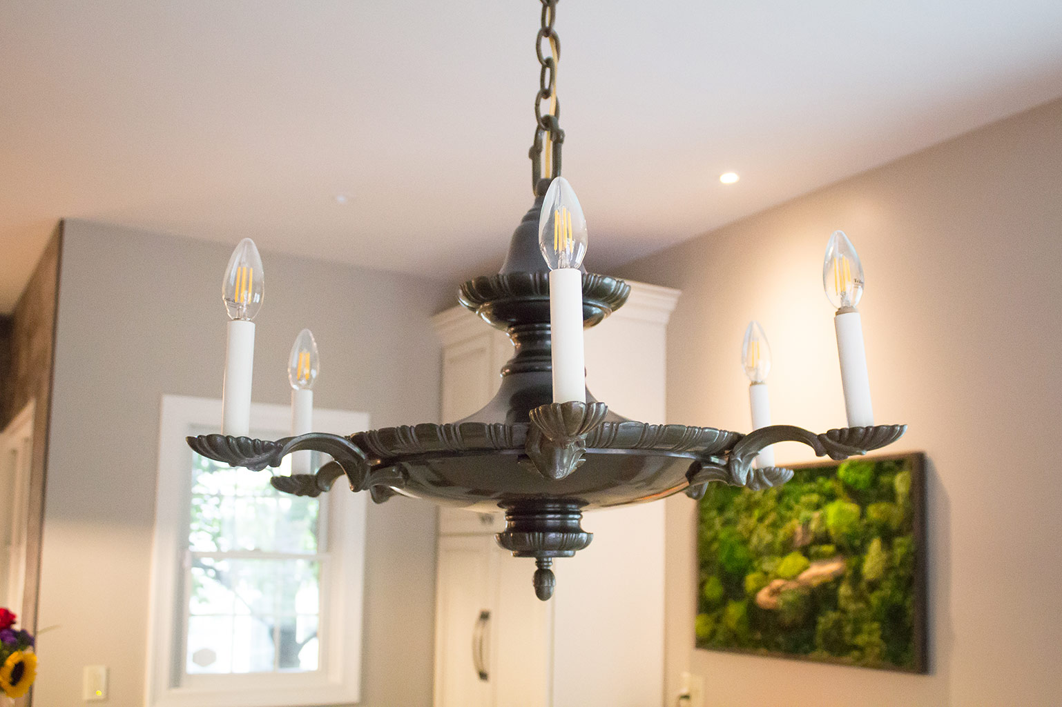
The existing chandelier, with its teardrop glass pendants, worked perfectly with this look, so I kept it. I think it really enhances the renovation.
 A Kitchen Renovation with Traditional Touches
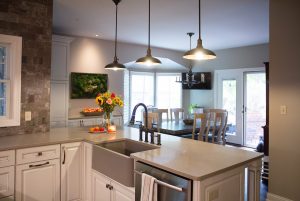
Next on my list was transforming the kitchen. This became a lot more enticing with all the extra space we suddenly had to work with.
The previous kitchen was closed off from a pantry and had a door at its entrance. We removed the doors to further open up the room, then set about adding more cabinets and counter space.
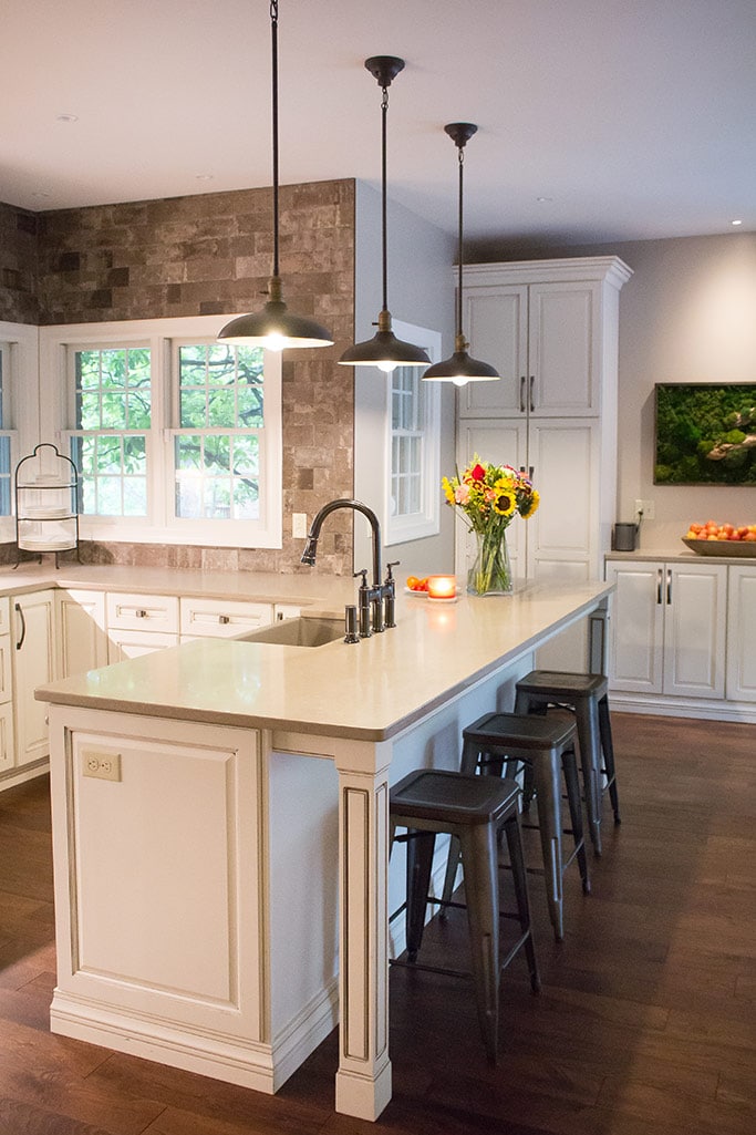
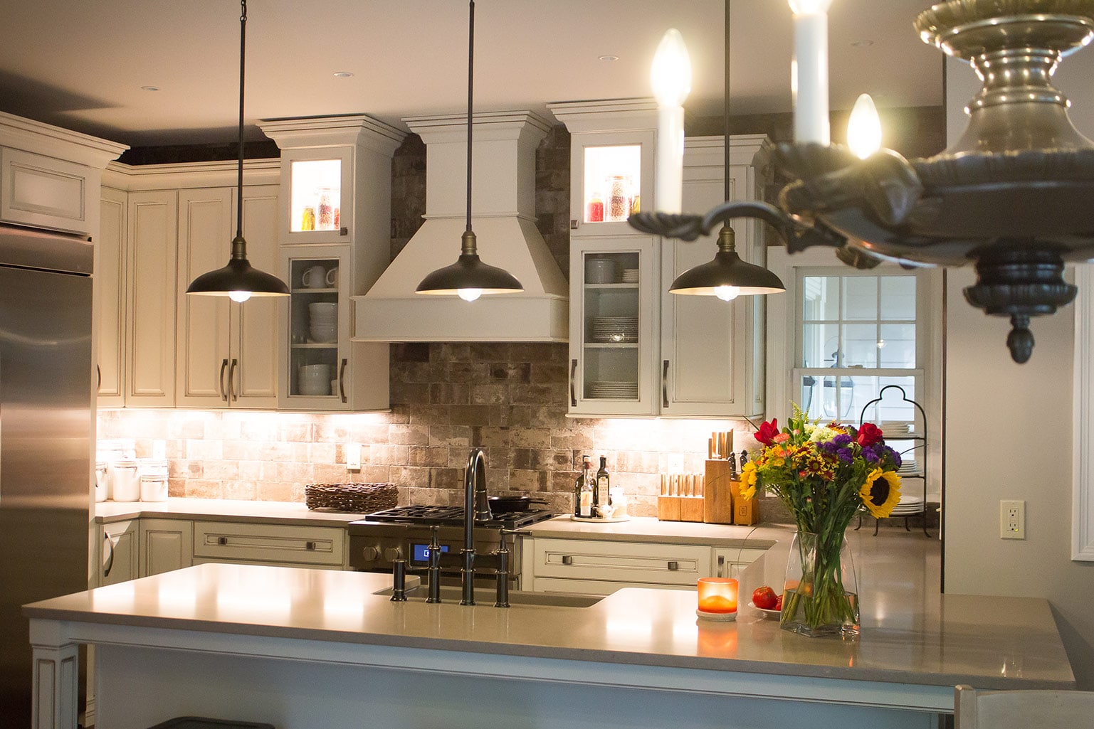
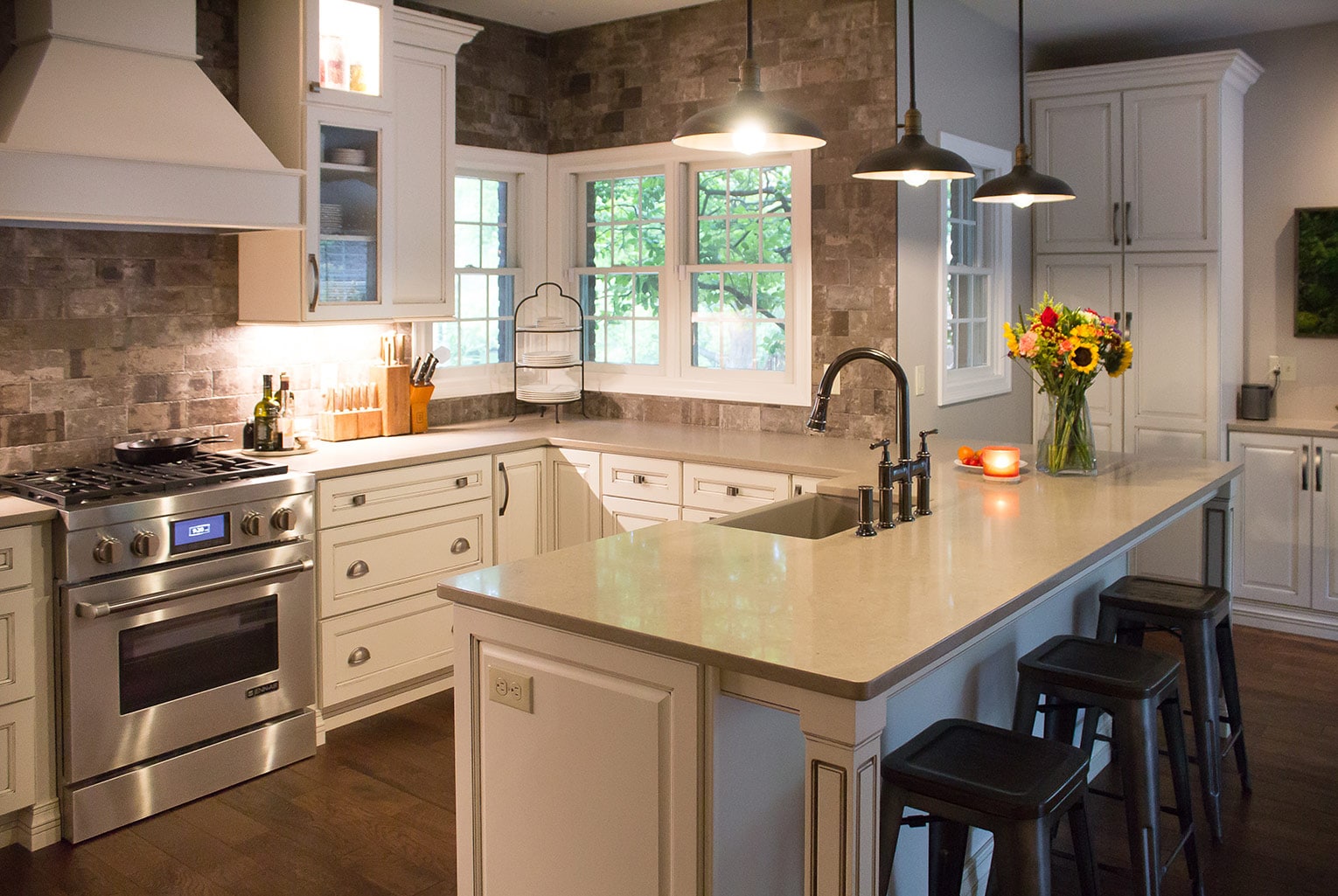
New wood flooring acted as an instant refreshener. The more dated wallpaper also came down, and in its place, we added a stone backsplash that extends all the way to the ceiling. This is a definite wow factor, as is the white kitchen hood.
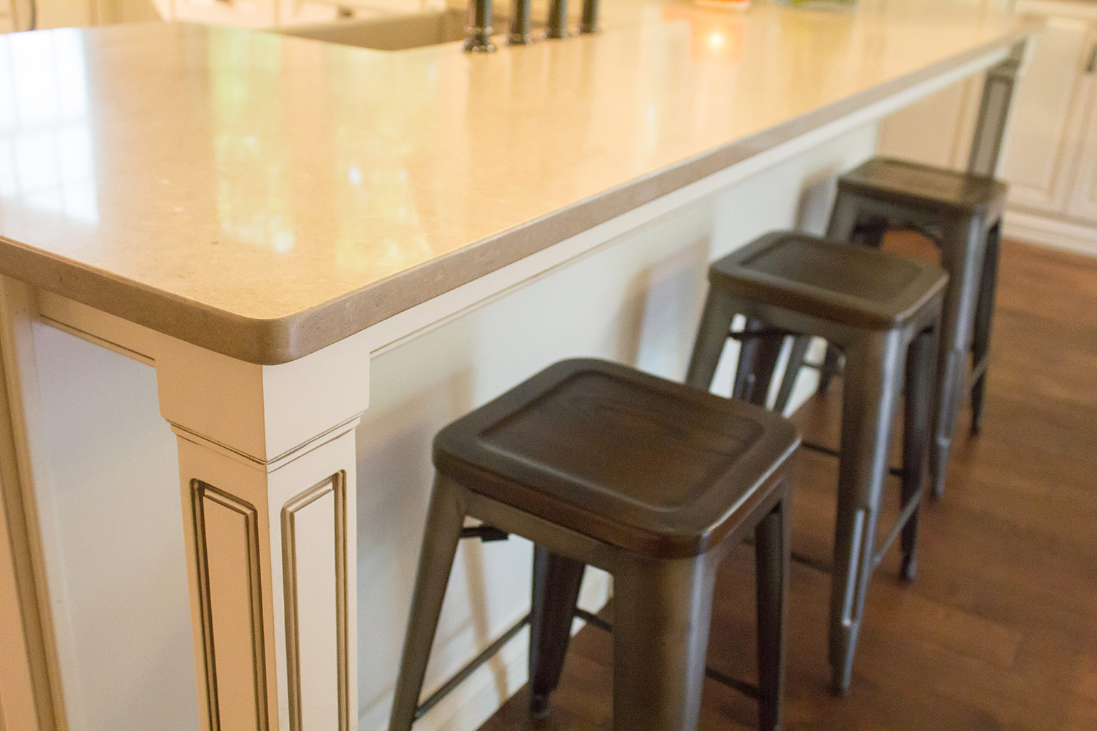
I went with white cabinets from ProSource of St. Louis, instead of the light oak that was there previously, for a brighter touch. We also added pendant lights, new countertops and state of the art appliances, for a classy look.
Knowing that the homeowners didn’t want to depart too far from the traditions that made this house their home, I was also careful to incorporate some antiques that spoke to them.
The light over the kitchen table and the old roaster pictured here are both from the husband’s family farm.
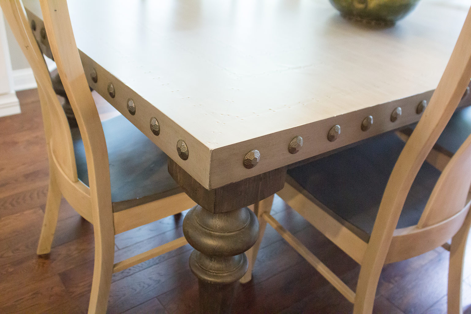
I was thrilled to be able to use these pieces. Some people would hunt high and low for these types of traditional touches! A newly purchased nailhead farmhouse table completes the look.
A Chandelier Sets the Scene
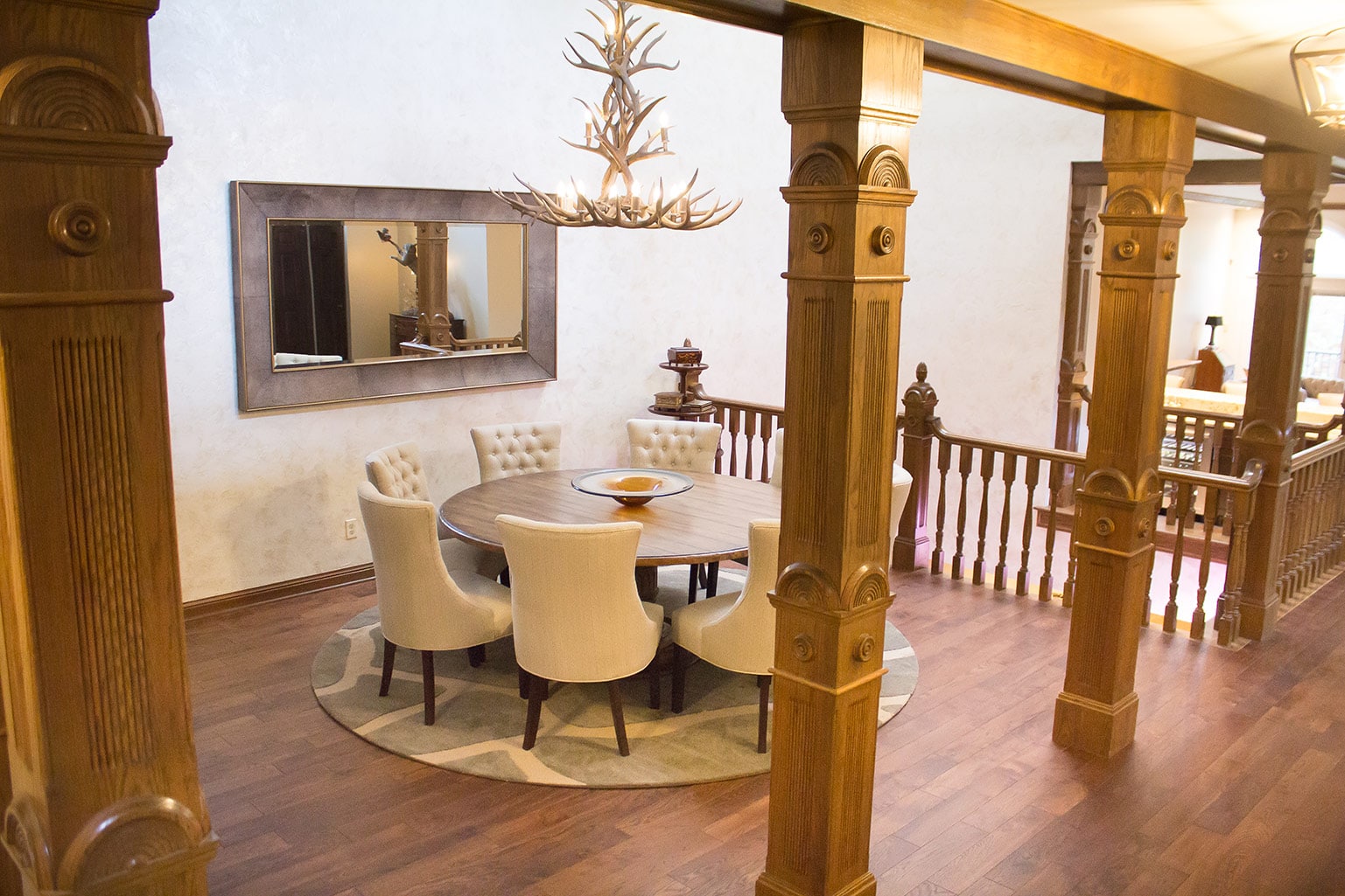
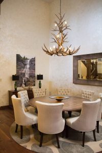
As you wander into the dining room, your eyes are instantly drawn to the chandelier.
A striking arrangement of antlers and candelabra-style lighting, this piece was a must-have the minute I laid eyes on it!
This is exactly what I am talking about when I speak of blending the unique characteristics of the home with new and distinct pieces of decor.
This light fixture is glamorous, traditional and outdoorsy all in one — even though that sounds like an oxymoron! You could use that same set of adjectives to describe the entire renovation.
With the lighting selected, the rest of the room’s decor naturally fell into place. Given that we had a dramatic focal point, I wanted muted colors and elegant materials elsewhere. The chairs are timeless, the table is soft and inviting, and the wallpaper adds a sophisticated touch.
This space becomes particularly grand when you view it from across the atrium, while sitting in the newly renovated great room.
So let’s talk about that great room.
Soft, Feathery and Great
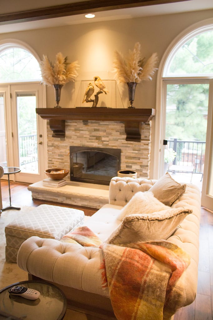
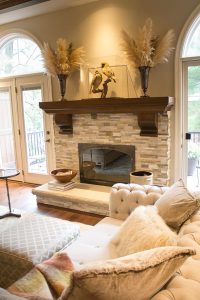
Our first step in this room renovation was a new fireplace design. The old fireplace just didn’t fit with the new look of the house. I was looking for something that would really add that elegant but rustic charm.
So we replaced the brick with a mix of grey-toned stone, and refinished the mantle.
The impact of these changes is really striking. And the choice of accessories brings the design to another level.
The couple added new furniture in soft cream tones to help finish off the room’s transition, and we were able to repurpose a chandelier that used to be in the foyer.
The feathery mantel arrangements and throw pillows add lush texture. We also added some new fixtures from Metro Lighting.
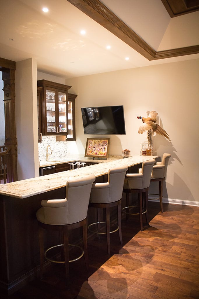
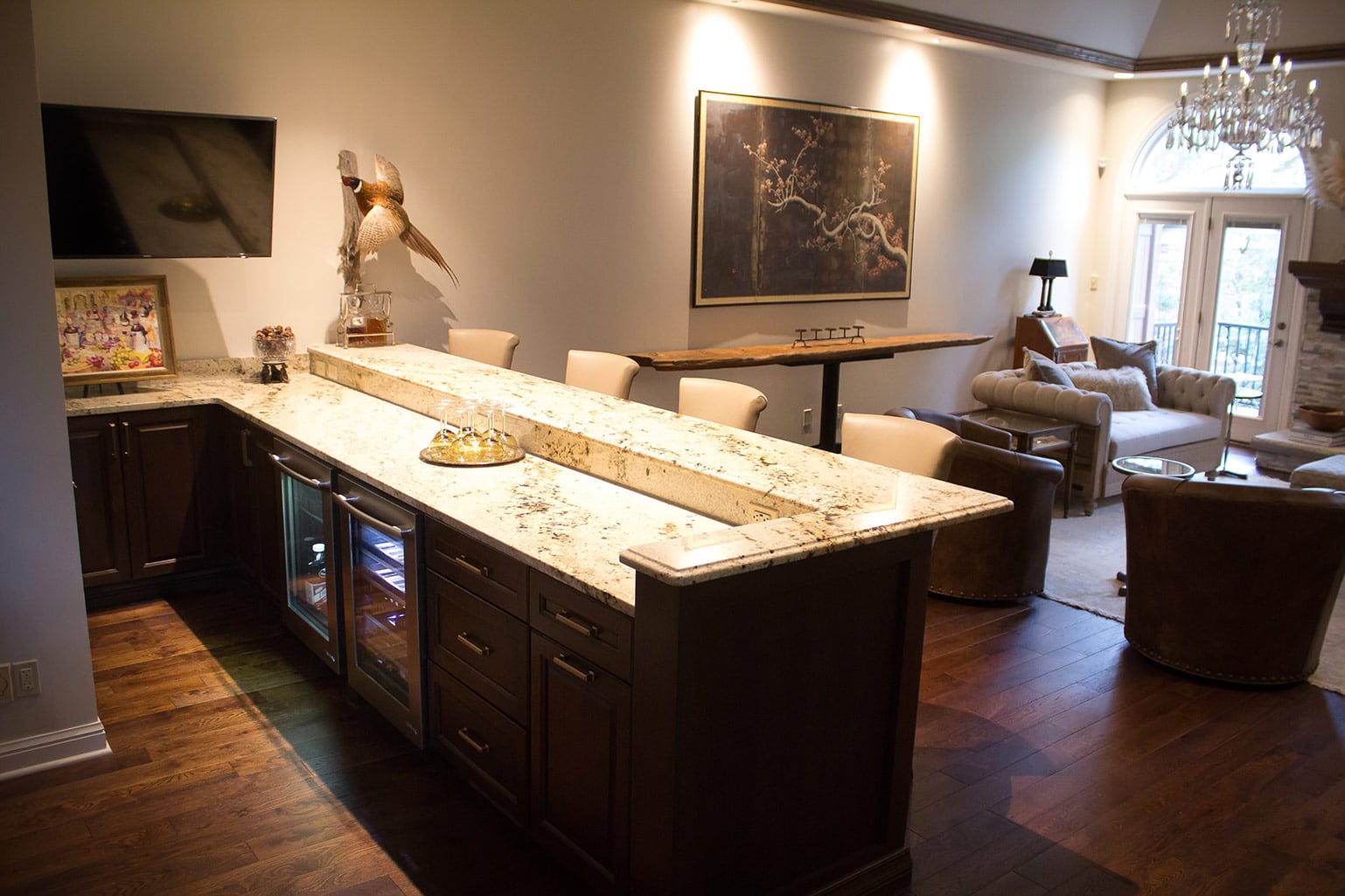
Our second major change in this room was relative to the bar area. The previous bar was nice, but small and closed off.
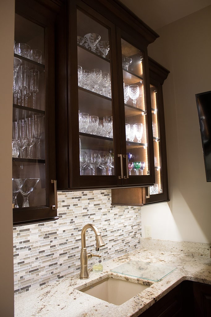
We extended the bar and added a new granite countertop, and also replaced the cabinets and added a backsplash for an elevated design.
A Design Challenge
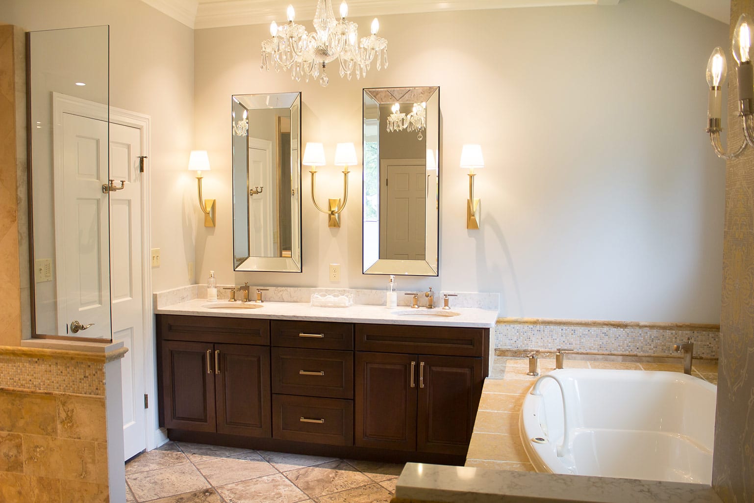
The couple was also interested in updating their master bathroom.
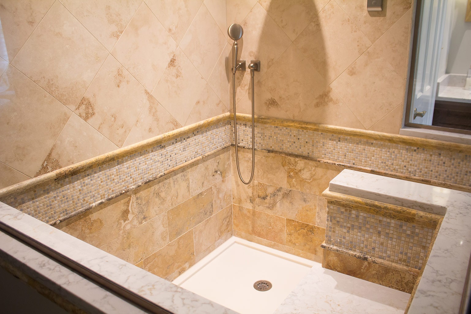
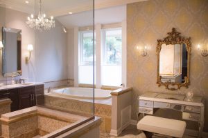
Here, we had to be creative. They wanted a more modern and open look, but the soffit in the existing shower could not be removed, and thus presented a design challenge.
I decided we could overcome that challenge by removing the shower walls to expand the space. This allowed us to suspend the glass further out and add a seat, turning what had been a small shower into a walk-in that feels more luxurious.
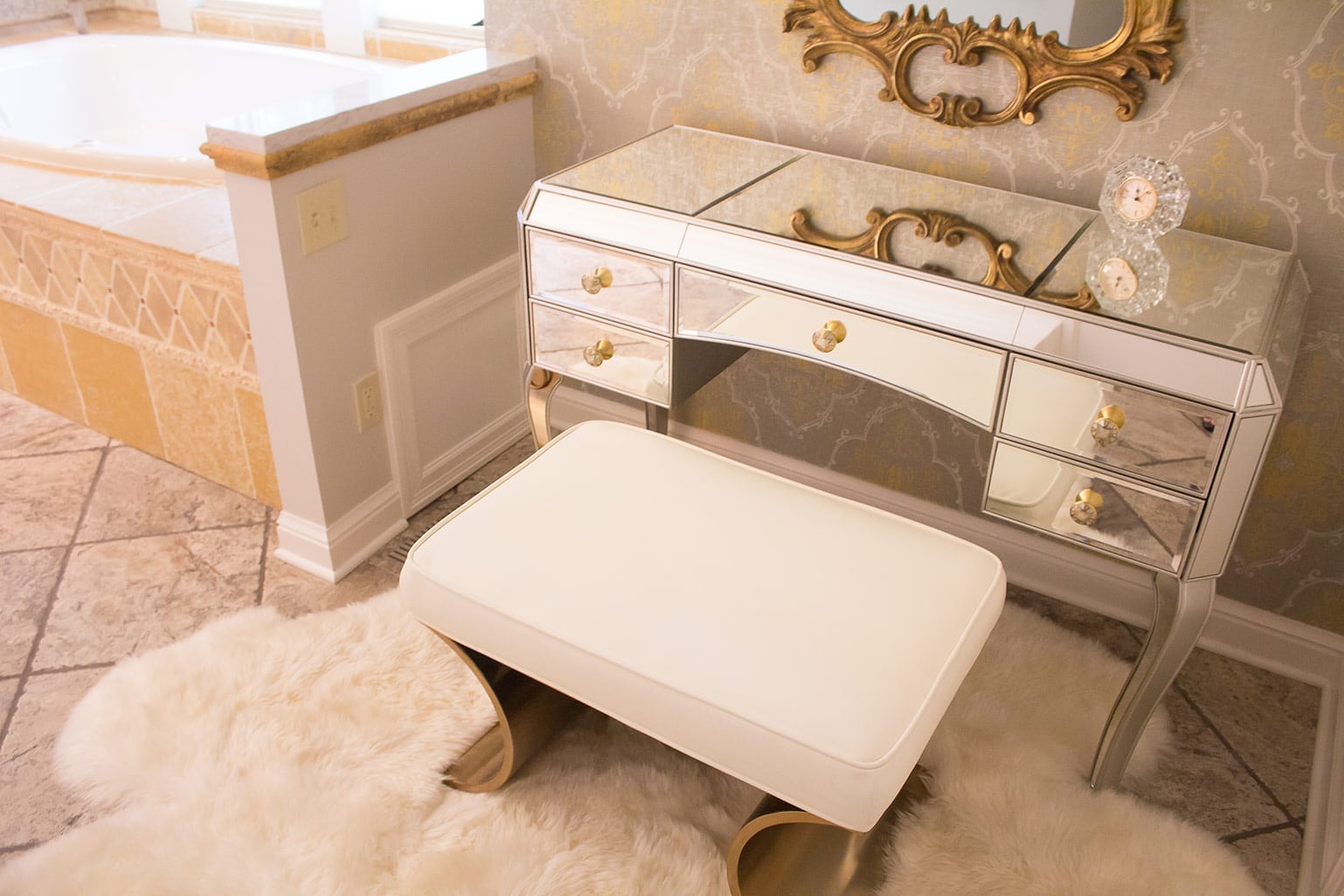
The homeowners had just redone their tub, so we kept that and worked with it when designing the rest of the bathroom. I found tile that pulled the look together, and we added new cabinets and light fixtures to freshen everything up.
We removed the door to the bathroom, as well as the wall-to-wall mirrors that dated the room.
All in all, it looks like a brand new space! My next project for this couple’s home renovation is working on the showers in the guest bathrooms. I can’t wait to start!
As always, please give me a call with any questions or project ideas. I’d love to help with your home renovation!
