

By now, this much is clear: gray has a firm toehold in the interior design world.
But it wasn’t all too long ago that beige was the color du jour. It was, in fact, the neutral of choice through much of the 1990s.
As a result, I often encounter homes that are blanketed in 50 shades of beige. Usually in these cases, the client has called me in a panic, fretting that their home looks dated. They’ve heard the lament: beige equates to boring.
That’s when I try to reassure them. Yes, beige everything can be quite humdrum. But there are ways to make beige work even in this age of gray, and there are also ways to transition your home to gray without an overhaul.
This is important, because not everyone has the time, energy or money for a complete renovation. A design refresh is often much more appropriate, especially when you consider the fact that trends change — today’s gray may be tomorrow’s beige.
With that in mind, here are a few tips I give to clients when they are swimming in beige but thirsty for gray.
Bring In a Warm Gray Paint
The simplest way to transition from beige to gray is to repaint the walls. But chances are, if your walls were previously beige, your decor is also an array of warm tones or creams.
So if you want to avoid picking all new furniture, counter tops and accessories, you’ll want to make sure you pick the right gray — not just any gray.
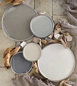
I usually tell clients that as long as we stick with a warm gray, it’ll be okay. This means paying attention to the undertones.
Warm grays will often display subtle purple, taupe or green undertones, and will even contain a bit of brown. This will best complement everything you already have in the room.
For more on picking out the most appropriate gray for a formerly beige space, read this designer’s musings on the subject. She points to one dark gray in particular that pairs well with travertine tile and warmer granite and marble.
Remember, I am always eager to help in this area. Picking neutrals can be a lot more challenging because of all the subtle undertones that won’t show themselves until the paint dries or light hits the wall in a certain way.
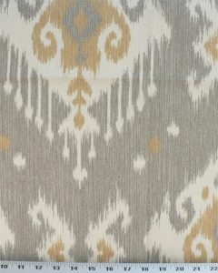
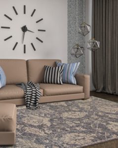
Mix Your Beige and Gray
There is nothing in the design rulebook that says you can’t mix your beige with gray. Save on costs by working in fabrics and accessories that combine the two colors, giving you a platform for bringing in more gray elsewhere.
Now, get your Google fingers ready: Type “combining beige with gray” and you’ll find a host of design examples where this combo works really well. Maybe it means finding a couple throw pillows or curtains that mix the two colors.
There is an array of fabrics out there to choose from. I just love this Dakota Gray fabric. It gives off a chic boho vibe that nobody in their right mind would say is dated! A gorgeous rug – check these out – can also incorporate gray into a formerly beige room without completing removing every trace of warm tones.
There’s a lot more where that came from, so let me know if I can help you in this department as well. I have a number of resources at my fingertips and have been storing ideas on this subject for quite awhile now!
Tame the Tuscan Influence
A number of beige-centric homes I am called to also have a very heavy Tuscan influence.
You probably know what I’m talking about: the deep burgundies, fringes, ivies and grapes, heavy wrought iron accents, etc. This style had its heydey about a decade ago, especially in this part of the country.
But it doesn’t really speak to what’s en vogue today. So when clients call me because they think their home looks dated — and they believe beige is the culprit — I first like to discuss how they are using beige.
If they have any of these Tuscan tendencies, our solution may be pretty straightforward. Here is a blog post that speaks at length on how to tame the Tuscan influence.
In short, do away with all of those vineyard-like accents, lighten up your fabric choices, and get rid of anything red!
There’s a lot more to it than that, of course, so I encourage you to give me a call so I can walk you through the different options.
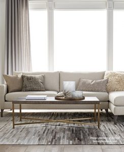
Refresh, Don’t Redo
Beige doesn’t have to be bland.
Bring in patterns, textures, and layers of neutrals to get the same light and fresh feel that you are seeing in all those homes that are on-trend in gray and white.
Done properly, you can give your home an added elegance that may not be achievable in those other homes, which may be trying too hard for a farmhouse or vintage feel.
Choose luxurious fabrics, fur and natural elements. Lighten things up with a heavy dose of cream-colored accents.
I like to have my clients think about beautiful outdoor scenes — very rarely are they comprised entirely of cool tones.
Think of sand, earth, trees. All beige! I love opening my clients’ eyes to what beige can do. For just a couple examples of styles I can achieve for you, read here and here.
I hope this provides good food for thought. Remember, I am here to help you in your design journey. So if you feel like you are in a beige rut, give me a ring. I can help you find the look you are aiming for and it doesn’t have to mean a major project for you or your home!
Feature photo copyright