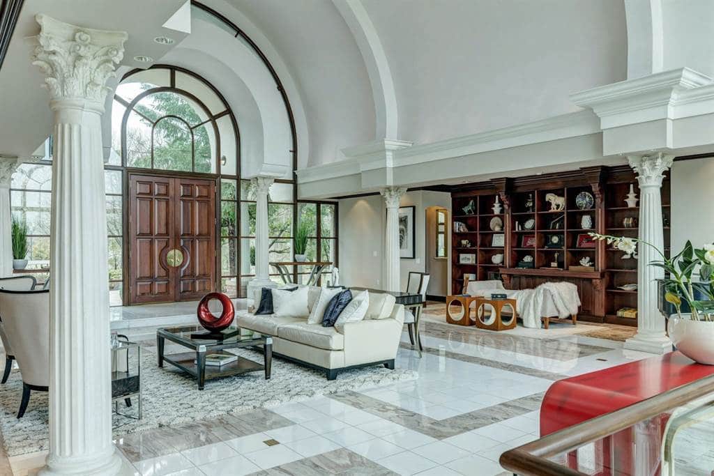
 If you’ve been following this blog, you know how excited I am about the staging work we’ve been doing.
Well, I wanted to show you one of our recent projects so you can see first-hand how high-end staging can help elevate a luxury home when it hits the market.
Dielmann – Sotheby’s International Realty has this Wildwood home listed for $1.7 million. The agent is someone who I’ve done previous staging projects for, so she called me in for this one as well.
The first thing you’ll notice is that this house is absolutely gorgeous in its own right. That’s why I say that staging helps elevate a space — because we’re not working from scratch.
We’re taking already beautiful properties and trying to maximize their potential and highlight their strengths.
So when developing my design plan for this home, I considered its strongest selling point — a voluminous interior.
I wanted a design scheme that would showcase all of that open space, allowing the eye to travel around and drink in the beauty of the home.
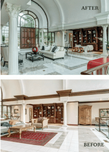
The second goal was to have the decor match the architectural style of the home. The existing furnishings were beautiful but traditional, and I felt this home needed a more modern touch.
So with those two ideas in mind, I set out to transform the space.
Our first step was new paint. I thought more neutral colors throughout would both help modernize and keep things open and airy.
The first floor walls had been a peach color, which to me felt dated. We changed it to a more versatile color that lies somewhere between a gray and a taupe.
There was also dark wood crown molding that made the whole room feel heavier. I suggested we paint it to a cream color so your eye doesn’t stop midway up the wall at that dark line.
It’s amazing what a difference that small change made! The room feels even bigger now.
The master bedroom was a peach faux finish and we painted that to a gray. Again, the goal was to keep things neutral and modern.
Toward that end, we removed all of the home’s existing furniture and rugs and placed them in storage.
All of the furniture you see in the “after” photos is mine — you may even recognize it from some of my previous projects. (One thing I enjoy as a designer is seeing how many looks I can get from one piece. It all depends on what you pair it with!)
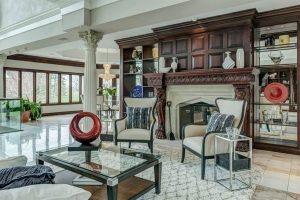 We stuck with a streamlined look, mimicking the architecture of the home – and we used mostly neutrals with a few select pops of a striking red.
Notice how both tables in this room are glass. That adds to the open feel and allows the chairs a to add visual interest with their sleek lines. And the light colors and unobstructed ambience keeps the focus on the wall of windows and beautiful property in the backdrop.
In the hearth area, simply rearranging the chairs and adding a more modern coffee table creates a more stylized look.
A contemporary bed frame and two chaises make for a luxurious feel in the master bedroom.
The previous rug, while gorgeous, dated the room so we replaced that with a lighter one that fits better with the new color scheme.
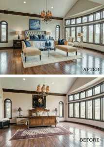 We introduced a calming blue as an accent color, seen in the artwork, table lamps, throw pillows and vases. The animal print armchair adds an elegant touch.
The theater room also got a quick and easy update by removing some of the heavier pieces of furniture.
We replaced the coffee table with an antique chest to bring the design up one notch.
Overall, the staged home feels fresh, modern and spacious. I’m envious of the lucky buyers who will soon get to call this beauty home!
[wonderplugin_gridgallery id=11]

