

I promised that I would eventually get around to posting the Color of the Year selections for 2021, and boy am I glad I waited! Because Pantone just stole the show with its announcement, which rolled out later than the other paint companies.
For only the second time ever, Pantone has announced two paint colors for the winning title. And their reason for doing so, is in my opinion, just perfect!
But before we talk more about that: For those who don’t follow the Color of the Year selections quite as closely as I do (I mean, I’m a little obsessed), let’s back up a bit.
Some background:
Every year, each of the leading paint companies will pick a color (or, in Pantone’s case, two!) that they believe best represents where hues will be heading for the upcoming year. There’s a lot that goes into those selections. But often, the paint companies try to pick colors that reflect the cultural or societal trends of the moment.
It is a lot of fun as a designer to try to guess ahead of time what these selections will be. And even more fun to start incorporating them into home projects!
Some Advice
Now, a word of caution: I never recommend taking a Color of the Year and designing an entire house around it. After all, the selections change every year! But the paint companies’ picks can be a helpful guide for tuning into design trends and movements. And they also help us designers keep tabs on what looks and colors will be popping up in showrooms and magazines.
Typically, I’ll try to incorporate some of these colors into accessories, textiles or accent walls, or even smaller pieces of furniture. That way, if things swing wildly in a different direction in the years that follow, you aren’t stuck with an expensive change or eyesore.
Some years, of course, are easier on that front than others. But it’s also OK to just take note of the colors and pocket them as ideas for the future. There’s nothing that says we all have to march to the beat of the same drum!
Also, it’s worth noting that these color trend forecasts are for all design industries, not just interior design. Fashion, beauty, products, graphic design — you name it. So you can expect to see these hues all over the place in the coming year!
So with all of that by way of background, let’s take a look at this year’s picks…
Pantone’s Pick: Illuminating and Ultimate Gray
So, this is the selection that gave me goosebumps. For real! Not only did Pantone decide to go against the grain with two selections versus just one, but they did so for a really cool and reflective reason.
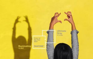
They chose Illuminating (13-0647), which reveals itself as a bright, sunshiny blast of optimism. And also, they picked Ultimate Gray (17-5104), which communicates a steady, soothing presence. With this combo, Pantone is trying to put colors to the strangely uncertain yet hopeful time that we are experiencing.
“Each of them has their own emotional aspect, the gray being the one that’s more supportive and solid, the practical foundation that we need, and the yellow is about hopefulness and sunshine and good cheer,” Leatrice Eiseman, executive director of the institute, told TIME magazine in its piece about the reveal.
Pantone mentioned the pandemic and events like the Black Lives Matter protests of 2020 as influencing its selection. Eiseman said that the dual phenomena of social distancing, and mass protests for racial justice, made many of us realize how much we value our connections with others.
“Something that’s been apparent across the board is how much we need each other, that these connections with others have given us strength and fortitude, as well as the hope and the positive outlook that are essential to our moving forward,” she told TIME. “By choosing two independent colors, that helped us subliminally convey that message.”
Applying the Color Pick
As for how this selection will play out:
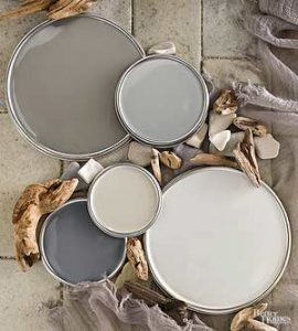
Gray is already a wildly popular color, for both interiors and exteriors. So I could see Ultimate Gray showing up in any number of places, from kitchen cabinets to garage doors to wall colors.
I’d advise being more careful with your use of Illuminating. Use it sparingly as a pop of color where it can have the most impact.
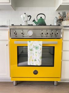
Maybe it’s a bright yellow shower curtain in an otherwise neutral bathroom, or some sunny throw pillows on a white or navy couch. The more daring among us may be tempted to try this on accent walls or cabinetry. I’d say go for it! As long as it doesn’t feel forced, like you are using it just because you wanted to find a place for the Color of the Year.
You could also consider pairing the colors together in one space. Houzz has already started playing with a number of options in this article.
No matter how you consider using it, Pantone described the yellow/gray combo as “a marriage of color conveying a message of strength and hopefulness that is both enduring and uplifting.”
And that’s something we all could use more of right now!
Sherwin-Williams’ Color: Urbane Bronze
Now, moving on to some of the other selections.
Sherwin-Williams hit the nail on the head with its pick of Urbane Bronze (SW7048). It’s a rich and moody color that seems just perfect for a sophisticated office or living room, or maybe a luxuriously restful master bedroom.
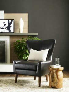
Warm but balanced, this brown-grey also has a hint of a metallic feel for extra opulence. Its message is one comfort and retreat.
″The home is now the ultimate retreat from the world, and color is an easy and effective way to create a personal haven,″ said Sue Wadden, director of color marketing at Sherwin-Williams, in a press release. ″Urbane Bronze encourages you to create a sanctuary space for mindful reflection and renewal.”
Sensing a theme? The paint companies are delving deep into our inner psyches this year!
Joking aside, I’ve been a fan of this paint color for quite awhile so I was excited to see it getting its due attention.
To me, it is not overly masculine or feminine, and can really add depth and richness to a space. And it is a nice break from all of the uber-light and bright-white interiors that we have seen in recent years!
For some design ideas, check out this post by The Creativity Exchange.
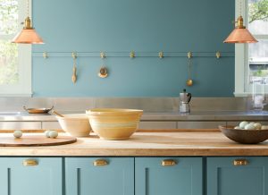
Benjamin Moore’s Color: Aegean Teal
Benjamin Moore’s pick for 2021 also taps into our collective angst and offers us a soothing tonic in Aegean Teal (2136-40). This tranquil blue-green color is both modern and calming, and draws to mind dreamy ocean scenes or springtime bliss. Think robins eggs or bridesmaid dresses. The paint company calls it “an intriguing midtone that creates natural harmony.”
Andrea Magno, the Director of Color Marketing and Development at Benjamin Moore, told Martha Stewart magazine: “We find ourselves gravitating toward soothing, sunbaked hues that create an emotional connection with our surroundings.”
It’s another reminder of the comfort we can find within our own homes, especially during unsettling times.
As an interior designer, I’ve seen first-hand how creating an eye-pleasing home can enrich one’s days and interactions with others. So I’m a big fan of the inspiration behind this selection!
I could see this color being used beautifully in kitchens, bathrooms or kids bedrooms. But those are just some examples. With a hue this welcoming, there are lots of ways to incorporate it into your home.
And don’t limit yourself to the interior. When I see this peaceful blue-green, I immediately think of how pretty and welcoming it would be on a front door!
When it comes to color pairings, think creamy whites or soft browns. Or maybe organic, beachy colors and textures like rattan or white oak.
Don’t Stop There
Of course, there are plenty of other picks to peruse. Check out this article for more selections from paint companies like Farrow & Ball, Glidden and others. Lots of food for thought!
And remember, I am only a phone call or email away if you’d like my thoughts on your options. Simply looking to freshen up your home? Looking for ways to bring some of these colors into your new build or redesign? I can help!
As always, I hope everyone is staying healthy and happy. And if we don’t talk before then, enjoy your holidays!!!