Builders love display homes because they show off their work to potential home buyers. I love display homes because they are the perfect blank canvas for the staging arm of my design business!
So why am I talking about display homes now?

Well, I recently staged a display home for The Kemp Homes Company and I’m eager to show it off.
This display home, in Lake St. Louis, will be open for one year. It’s part of the West Ridge Farms subdivision, where detached, villa-style homes will start for sale at around $290,000.
Buyers can choose from three different floor plans with a variety of elevation choices, and the builder will take it from there. Customization options are also available.
The goal of the display home is to entice homebuyers by giving them a vision of what it would be like to live there.
As you can imagine, in these cases the interior design work is essential to the overall mission. Because as I’ve mentioned previously on this blog, nothing sells a home faster than proper staging!
Blank walls and empty rooms just don’t grab a buyer’s attention in the same way. And spot-on staging can help highlight attributes of a home that might otherwise go unnoticed (and, if I’m being honest, can also help compensate for any weaknesses).
So take a look at this latest project and see what you think. You can get a general sense of what the home looked like before I started decorating by taking this virtual tour.
I wanted this to scream “Buy me!” Hopefully, that’s exactly what I accomplished here.
Gold and Grey on Display
Sometimes when I am hired to stage a home I will come up with a tentative game plan before actually visiting the site, just based on conversations with the builder or owner, and pictures.
Usually that’s enough to get my creative juices flowing and I can make any tweaks or adjustments once I’m there in person.
With this home, though, I planned a walk through a little bit earlier than usual and I’m so glad I did!
I noticed during my visit that the interior had a lot of grey with brushed gold accents. This is a very popular color combination right now and I wanted to capitalize on it!
So I immediately started rummaging through my supply of furnishings, accessories and wall art to see what I had that could pick up on those tones.
I also knew that I wanted to stick with a transitional design for this project. A transitional style is usually the best way to appeal to a wide range of tastes, and you never know who your potential buyers might be.
My design work included a master bedroom on the first floor and one other bedroom that can be used as a bedroom or a study. The basement is unfinished.
Whenever possible, I tried to do what I could to allow the builder’s work shine. You’ll notice this in areas such as the kitchen, where I kept the accessories to a minimum.
So my touch throughout the home is subtle, but hopefully significant.
All that said, let’s take a little tour, room by room.
Soft and Sophisticated Neutrals
When I think gold and grey, I think soft and sophisticated.
So that was the rough design “theme” I tried to adhere to with this project.
Let’s start with that kitchen I talked about earlier.
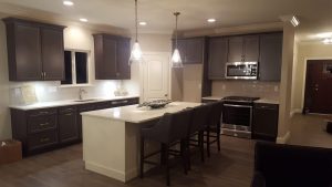
As I mentioned, I really wanted to allow the craftsmanship of the builder to take center stage. So I added a few elegant countertop accessories and left it at that.
My favorite element of this kitchen design is the pendant lights. My accessories try to compliment those lights, not distract from them.
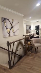
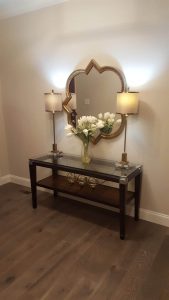
Moving on from there, I added a few welcoming touches to the entryway, and you’ll also notice a favorite painting of mine hanging above the stairwell that leads to the basement. Its gold veining just fit perfectly with this home. I couldn’t pass up another chance to use it!
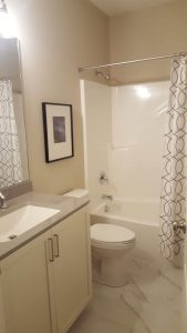
In the bathroom, the shower curtain and wall art are understated and elegant, drawing the eye to the flooring, which is creamy and dreamy.
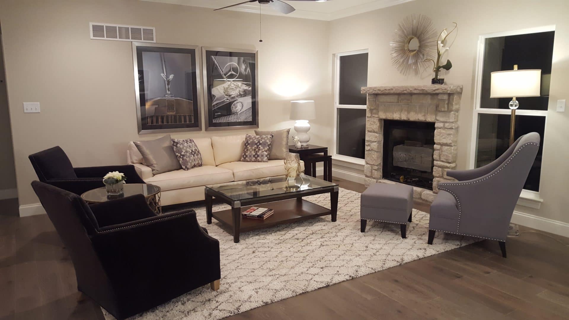
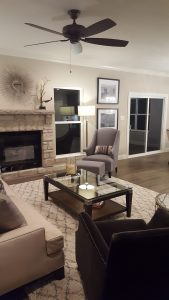
In the living room, the obvious focal point is the fireplace. I wanted to keep things neutral to compliment the beautiful stonework, so I chose some soft greys and creams for the couch, armchair and throw pillows.
The rug, with its soft texture and gold and off-white diamond pattern, pulls these various elements together. It also helps ground the space.
For my accessories, I used some gilded gold pieces that are graceful and draw inspiration from nature.
My favorite of these is the mirrored wall art above the fireplace mantel. It’s eclectic yet elegant.
The framed photographs balance the look out with a masculine touch, and compliment the darker, studded armchairs.
Lastly, we have the master bedroom. Here again, I went for understated but refined.
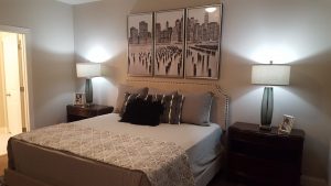
The black and white triptych photographs above the bed are a classy addition to the room, and work to highlight the studded headboard below. A smaller striped pattern on the bedding pairs well with the bigger pattern on the quilt, and I threw in some texture with the black throw pillow. A picture of Sinatra is on the nightstand because that’s how this room speaks to me.
Do You Have a Display Home Need?
So there you have it! I hope you enjoyed this “virtual tour” of my latest staging project. As always, I welcome your feedback, and I’d be even more excited to get to work on a project for you. So if you are looking for a fresh design or remodel, or are a builder looking for someone to elevate your next model home, please give me a call!
