Yesterday, Ellen and I did a rather cute table setting for a client of ours.
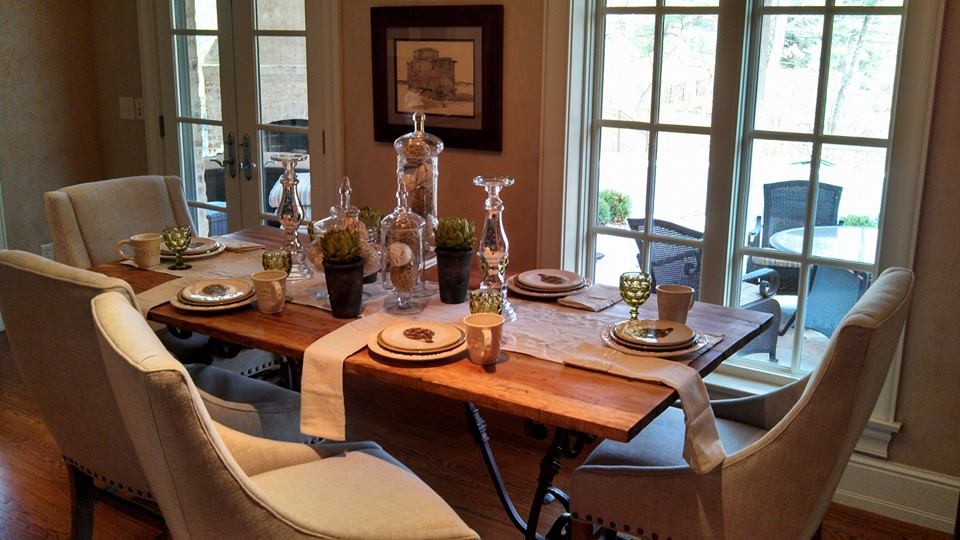
This particular setting is for everyday use, but it inspired me to post something about table settings, and since the holiday season has begun I thought this would be the perfect topic. Another thing that built on this inspiration was some of the client’s comments after we showed her what we did. The thing she said that most was, “I could never do that.” Well, no, you can. It’s really not as hard as some people think. Continue reading for some guidelines and examples.
1) create layers. You don’t want everything the same height, and you don’t want everything in a straight line.
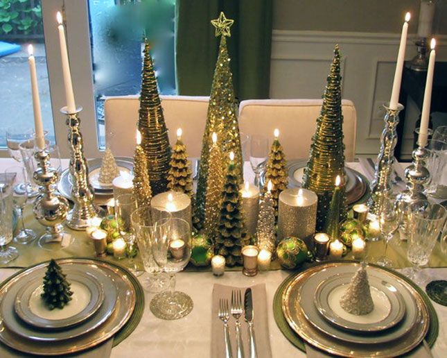
I love the varying heights in the setting. My eyes are being drawn throughout this setting because of the height changes. Height differences are one way to create visual interest. I also love how the center arrangement seems to extend out some toward the place settings but doesn’t encroach on the space of the place setting too much. To me this, this feels makes the table feel more inviting because it’s like center is trying to draw you in. I always think layering plates or putting something on the plate is a nice touch.
2) textures. Texture can add SO much interest. It’s nice to have some visual texture, as well as, physical texture. I find rustic place settings to be great examples for texture.
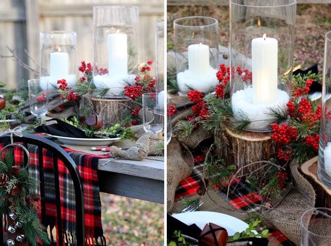
Your table doesn’t have to have this much texture, but I think this is a good example of all the different ways you can incorporate texture. The is roughness with the log pieces, salts in the jars, burlap, and garland, but there is a smooth with the plate, napkin, blanket, and berries. There is hard and soft.
3) color scheme. Pick a color scheme and roll with it. Red and White with either Silver or Gold is usually a traditional color scheme for this time of year, but I’ve noticed a lot of table settings that are more toned down and earthy. Whatever you choose, make sure the colors coordinate.
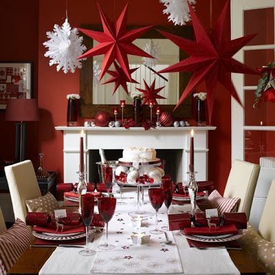
4) style. Find your style. If you have a traditional dining area then it probably isn’t a good idea to go super modern with your table. Can you mix elements? Sure. I don’t think that would be an issue, but you don’t want your table setting to be the total opposite of the space it is in.
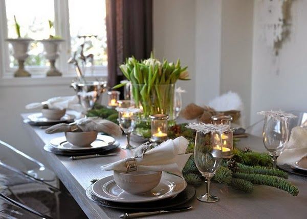
This is a nice transitional table setting in a transitional space. It blends with the style of its surroundings, but stands out because of the elements that went into creating it.
This isn’t something you have to spend a ton of money on. Ellen and I went to Home Goods for the table we did. We spent about an hour there, and we tried a bunch of different things. We grabbed plates and glasses off the shelves and created the look while we were there. If you create something in the store, and you don’t like it when you get home. Return what you don’t like. It’s not a big deal. You can also make or put together a lot of decorative elements at home.
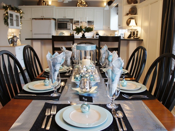
The table runner looks to be wrapping paper (I actually thought this was pretty neat). The centerpiece is ornaments poured into a shallow serving dish with a clear container wrapped with a single band of ribbon and a column candle sits inside. The place settings were either bought or something the owner already had. The napkins were probably bought. Pretty simple.
I don’t necessarily think these are rules you have to strictly follow, but I think they can be good guidelines, especially if you are starting to feel overwhelmed. I also think these images are good examples of different things you can do.
I think the biggest thing anyone should remember when doing any kind of decorating is be true to yourself and your tastes.
-Michelle
