Neutrals are all the rage in interior design right now. You don’t have to be a decorator or design expert to know that.
You can’t flip through a design magazine without finding a house or two or twenty that are awash in white and grey and other cooler, lighter tones.
But here’s a little tip: neutral doesn’t always have to mean light and bright. Neutral palettes can also be achieved with darker colors and pairings for a more sophisticated look.
Take this recent project I worked on for a couple at Chaumette Vineyards & Winery, as part of my ongoing collaboration with the resort.
I had already completed one villa for these clients. They since had purchased another from Chaumette and wanted it redone as well.
In fact, they were SO pleased with the first villa that this time when I asked them for their design wish list, they simply said “surprise us.”
Given their comfort level, I was fairly confident I could pull off a design that they would love. It was just a matter of finding the right inspiration.
The villa follows an architectural model that dates to the 1790s. French vertical log houses, which were popular at the time, resembled mountain chalets, oozing coziness and charm.
With that broad theme, I thought a modern farmhouse design style would be perfect.
This is also the design style that we followed in the first villa. So doing the same thing here established some cohesion between the two units.
But I went a little more “current” with this second villa and I like how it turned out.
Let’s see if you agree.
Black and White for Your Neutrals
The first thing you’ll notice is that I went with a black and white palette throughout. This adds to the modern farmhouse style, And it gives the villa a sort of MacKenzie-Childs’ vibe.
Using a gingham pattern in many of the rooms helped complete this look.
I also decided to update the flooring, with a dark, wide planked style from Hoods of St. Louis.
I felt this fairly major upgrade was necessary given how the couple planned to use the space. They intend to rent it out for stays, and will also use it for rehearsal dinners.
This is one of the larger units at Chaumette. It has four bedrooms, several balconies overlooking the gorgeous grounds, and a full lower level living space.
So I wanted to give the villa the attention and detail it deserves. I think we accomplished that.
Now, for some of the specifics, room by room.
Modern Farmhouse Kitchen
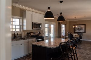
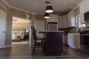
The kitchen really captures the farmhouse look with its white, Shaker-style cabinetry and handmade-looking counter stools.
I tried to pull this through to the lighting, from Murray Feiss. These fixtures could lean either farmhouse or modern depending upon the surroundings. In this case, it’s both!
The granite countertop helps marry the white and black aspects of the room.
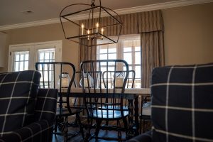
And the farmhouse-style table, from Hooker, perfectly serves its purpose, both aesthetically and functionally.
The really nice thing about this table is it extends to a much larger size. That was an essential functional detail, given the need to fit an entire wedding party at one sitting. But, of course, you wouldn’t want that big of a table all the time! So having an extension feature is key.
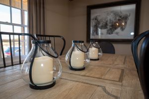
For an added touch, I used a set of lanterns for a centerpiece and a very agrarian looking picture for the wall — all still fitting with that black and white color scheme.
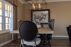
Finally, the chairs mirror the counter stools to help tie the two sides of the room together.
The walls and curtains are a neutral beige. This allows the black and white elements to take center stage.
Neutrals Meet More Neutrals
I was working with an open floor plan on the first floor, so it was important to create a nice flow from room to room.
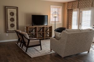
In the family room, I accomplished this with some black and white checked arm chairs, and a light beige sofa. Both bring in the neutrals from the kitchen.
These pieces and all of the other furniture, by the way, come from CR Laine, which carries some very elegant and distinguished looking lines of furniture.
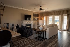
The rug, from Uttermost, works as a grounding element. And just like the kitchen countertop, it pulls together the various neutrals.
The fireplace tiles, in a faux brick design, operate in a similar manner.
I really fell in love with the living room coffee table. I could see it holding blankets or wine bottles for the perfect wine country touch!
The floor lamp is equally unique and a favorite of mine.
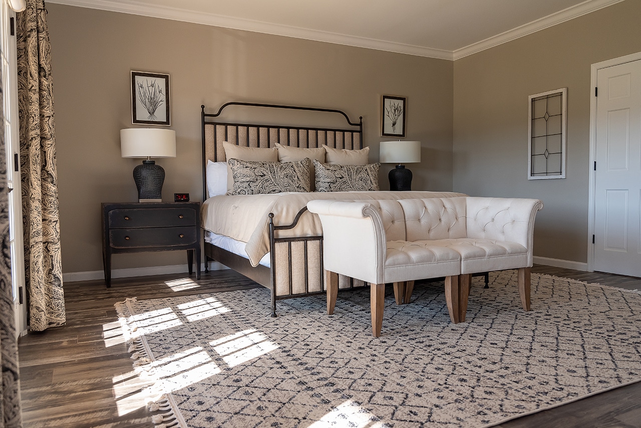
In the master bedroom, which is just off the kitchen, I stuck with the same design theme but went a little lighter than the rest of the home. I thought this lighter touch made the bedroom a bit more inviting and helps it stand out as a soothing retreat.
The rug, curtains and throw pillows bring in some patterns for variety. But otherwise I just piled neutral upon neutral upon neutral. Now, you’ll hear it from me first: that is a design trick that is harder to pull off than it looks!
The patterns I do use work to reflect the granite countertop in the kitchen, which can be seen when the connecting French doors are open.
The bed and nightstands are again from Hooker.
And we can’t do a proper virtual tour without also pointing out those bedroom views!
More to this Farmhouse Story
Moving upstairs, we have a bathroom with a vintage pattern floor tile that brings in more of that French country charm. I followed the same design philosophy with the freestanding oval tub.
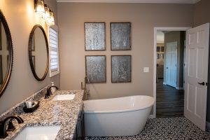
The rest of the bathroom is modern and neutral to make that tile and tub combo pop.
I used lilac paint in the upstairs bedroom to pull in some warm tones, and incorporated some floral patterns for softness.
Finally, we move to the lower level, which was fun to work on because it offered the chance to bring in a more casual touch.
I created a bit of an ethnic flair with my use of patterns. The one larger piece of wall art is particularly good at serving this purpose. It also helps highlight the tweed pattern of the sofa.
One final note: the other great thing about this floor is that it is entirely handicap accessible.
