Covid-19 has forced us all to change the way we work and the way we live. It’s been a big adjustment, for sure. But as I mentioned in my last blog post, I am also a big believer in silver linings. And I think I’ve found mine in how I’ve been able to adapt my design business in the face of this pandemic!
E-design and remote space planning were already growing needs pre-pandemic. Now, with so much occurring at a distance, those needs have shifted into overdrive.
These are now essential capabilities to have as an interior designer. Because when you can’t physically be in a space, you need to be able to imagine yourself there and have the tools to share all the design thoughts in your head. Make sense?
Well, I’ve already had a few projects this year where I’ve been able to flex those remote design muscles. And I think it’s been a fun challenge. Difficult at times, yes. But so very rewarding. Especially when you see how different professionals can come together in the face of geographical obstacles, and when you can make something look so fabulous you wouldn’t even guess it was designed remotely.
So I wanted to share one of those projects with you. This was a condominium renovation in Utah, which was doubly interesting because we actually started it remotely before coronavirus forced us to continue it from afar. Talk about design challenges! Here’s a little background.
E-Design and Remote Space Planning
The Temples are longtime clients of mine. They both grew up in St. Louis and lived here for many years, which is where I first met them and remodeled a home for them.
I also helped them build a custom home in New Hampshire, on Lake Winnipesaukee. And when it was time for the Temples to sell their St. Louis home, I decluttered and made some cosmetic changes, and staged the home to get it market-ready.
Then, two years ago, another project came on the horizon, when the Temples moved to Salt Lake City, while on a mission for the Mormon church.
While there, the Temples fell in love with Salt Lake and the Tabernacle. Renting an apartment in a high rise next to the church was a new way of life for them. And they realized they wanted to make it permanent!
The Temples chose to buy another condo, realizing the ease of condo living. But this one was larger, given that they were now planting roots. They hired me to remodel and furnish the entire unit.
I was more than ready for the challenge. And keep in mind, this was before coronavirus hit. So it was at the time a unique opportunity to e-design from afar — something I’ve always enjoyed when given the chance to do it.
We didn’t have a contractor to start, but then the Temples met someone in the elevator of the building who referred us to Mint Construction. We went with them, and I couldn’t be more happy with that serendipitous referral! The dynamic duo of Chancie Freed and Wes McColl handled construction and coordinating, and they were so awesome through the entire process.
Subject Line: New Molding!
I flew out in January to get everything started and to answer questions. Then, from that point on, we went remote with some e-design, Facetime and conference call strategizing.
I would send drawings of various changes to the condo, such as adding beams, molding details, painting existing cabinets, new lighting, plumbing updates, custom closets and so on.
Yes, it was a lot for a relatively defined space. Yet somehow, the Mint team kept it all on track and executed my vision perfectly!
When the coronavirus hit in March, they were fortunately able to continue working, because the entire building was empty. So we kept plugging away, and I was able to communicate with Wes during the whole process by texting answers to questions.
I ordered the furniture and rugs from various places, including some of my favorites: Hooker, Uttermost, Jaunty, etc. And I had them sent to a shipping and receiving place, Navis Pack and Ship Utah. I had used this company before with another client and had a good experience. This way, everything would be there and ready for us once we needed it.
Furniture arrived for the most part at the beginning of April, with delays on the area rugs, which were stuck in LA (As if e-design wasn’t enough of a challenge on its own! I could devote a whole other blog post to the Covid-related delays in materials and supplies).
I was originally supposed to fly out in the middle of April for finishing touches and install. But because of Covid-19, I had to cancel my trip. So once again, we relied on remote communication and coordination with others who were already on site!
Navis delivered all the furniture, and over the course of two days, they were able to set it up, dialing me in on Facetime so that I could make sure everything was properly placed.
My clients also hired the wife and friend of Navis’s owner to unpack. Everyone pitched in and helped — it was great to witness!
E-Design Details
So here’s a quick rundown of the changes we made, although I will mostly let the pictures speak for themselves.
I’ll start with the main living space.
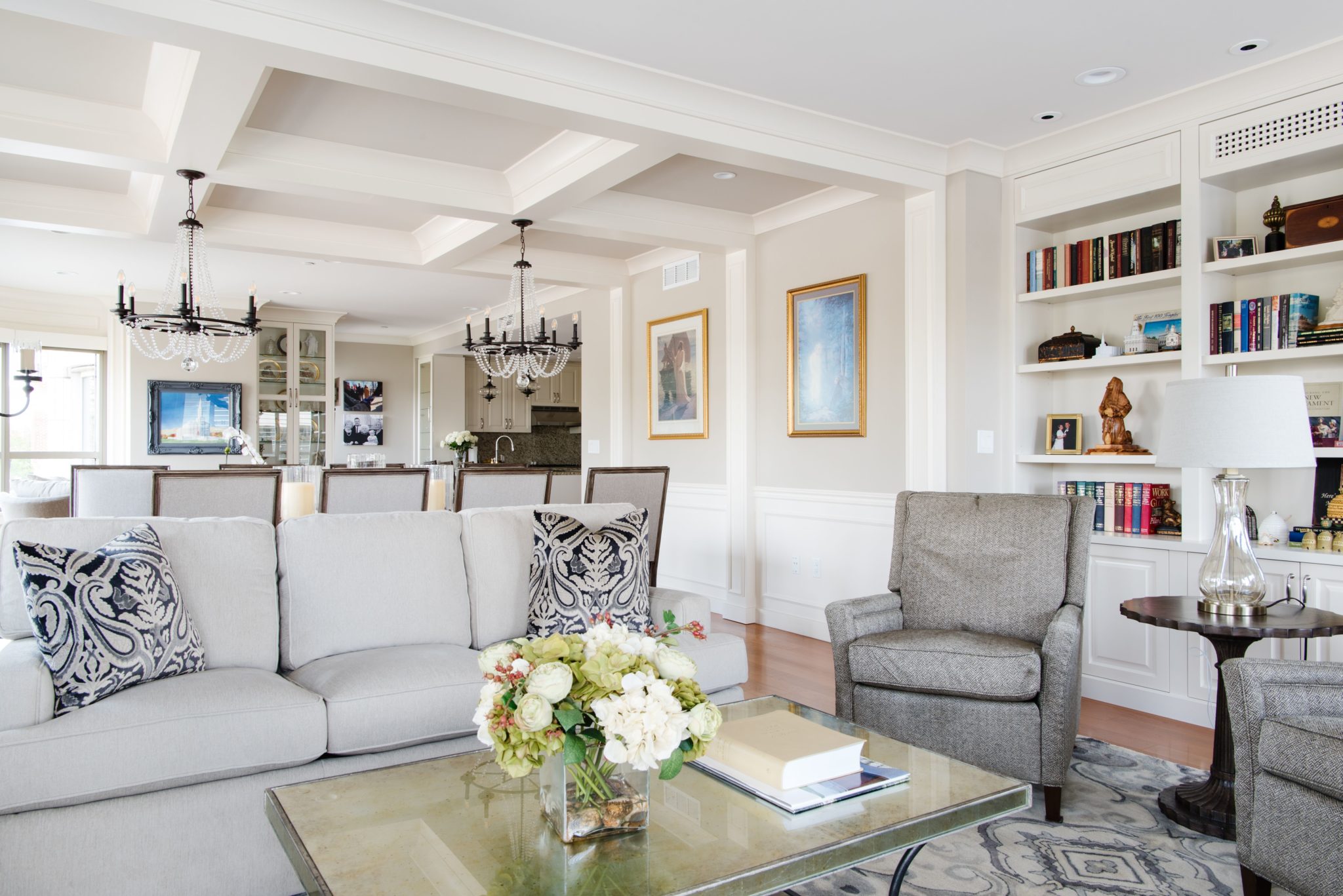
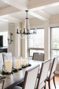
Most impactful, in my opinion, was all of the detail we added through molding and trim work.
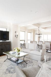
We added a beam ceiling in the middle of the larger room to help define the dining space, and a chair rail and wall panels to add texture and elegance.
We also added columns to help further define each zone in this open floor plan, and also to enhance the beautiful windows.
And speaking of enhancing the windows…
We also introduced some more molding details above the windows, along with some crown molding, to make everything pop.
In my opinion, these details, along with the coffered ceiling, are what brought this space to a new level of airy elegance.
We also brought in some plantation shutters to the far end of the room for light control, and automated shades for privacy. New recess lighting and chandeliers were a must given all this gorgeous detailing, so I was very careful with those selections.
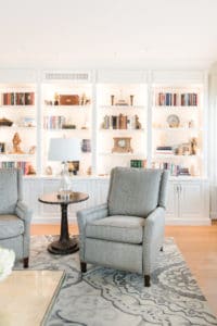
Finally, we painted the kitchen cabinets a custom color to match the trim. And we added a wall of bookcases at the far end of the room for display. Those shelves might actually be my next favorite element of this new space.
To tie everything together, we used various tones of Sherwin Williams Accessible Beige (SW7036) and Balanced Beige (SW7037) throughout.
Final Touches
Now let’s move on to some of the other rooms in the condo, which also benefited from some remote planning and e-design.
For the study, I picked out a custom herringbone cloth wall covering from Phillip Jefferies. I just love the texture it added.
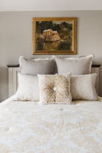
In the master bedroom, I added a paneled accent wall. And in the master bath, we painted the cabinets and added sconces above the vanity. We also added more molding detail, to match the mood of the rest of the condo.
In the entry hall, we added additional panel moldings and crown molding, as well as a new light fixture. And in the powder room, I chose to update the vanity with some fresh paint, and also added new sconces and a mirror.
Call Me
So that about sums it up! I was proud of what we were able to accomplish in this space. The Temples now can enjoy elegant condo living and they can tout the fact that almost all of it was planned from a distance!
I’d love to help you with any similar needs. So as always, don’t hesitate to reach out if you have a project on your mind or some general design questions that I can answer. I’m always happy to help — from near or far!

