I recently had the pleasure of working on a remodel project for an absolutely gorgeous home in Wildwood. And when I say gorgeous, I mean GORGEOUS.
This stunner has an idyllic stone exterior, three interior levels with ample square footage, custom cabinetry, vaulted and coffered ceilings, and beautiful millwork and stone work to boot.
It includes all of the “extras” you might dream of in a home. There’s a master suite with a sitting area and double sided fireplace. Also, there’s a patio retreat with a fire pit and waterfall feature. And there’s multiple common spaces and play areas for kids, a home theater, wine bar and more. It truly is a sight to see.
Well, needless to say, I’ve been eager to get some pictures of this remodel up onto my blog.
And I think the takeaway is that no matter how big and beautiful the structure of a home is, there’s always an opportunity to make design choices and improvements that can take it to a whole new level. Hopefully, you will agree that I did so with this remodel.
SOME CONTEXT
By way of background, the owner purchased this property in 2013, with the intention of moving in and making it his own. However, plans later changed. So he hired me to give the home all of the updates it needed to fetch a top dollar when he either sells it or rents it out.
The interior design was a little dated. I was looking for ways to both brighten up and modernize the home. But I also wanted to keep all of the custom features and detailing intact.
So I went room by room, in some cases just tweaking, and in other cases, going for a more extensive overhaul. Fresh paint, new hardwood floors and lighting played a major role. Same thing for the kitchen renovation, which is where I probably put in the biggest effort. I wanted to keep the custom cabinetry found throughout the home, but moved some of it around to help with flow.
Overall, I had a wonderful time and felt fortunate to work on this remodel. Hopefully, you’ll enjoy viewing the project as well.
So let me take you on a little “tour”, floor by floor.
A FIRST FLOOR REMODEL FANTASY
As I mentioned, the kitchen is where I made some of the more significant upgrades. So I will start there.
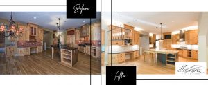
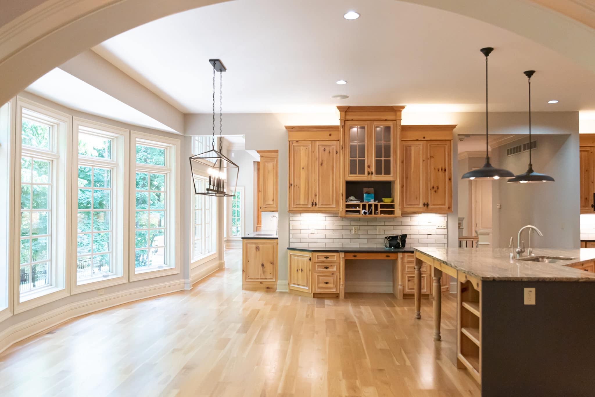
I wanted to make everything look a little more modern and streamlined. The first step in getting there was reconfiguring the kitchen island. By changing the shape and increasing surface area, we ended up with a more functional design. And I swapped out the countertop material for a nice, new Cambria quartz, to elevate the look.
I replaced a stucco hood with a more modern looking stainless steel. And I brought in a new backsplash in a subway tile pattern. All of the red tones that had previously been in the kitchen were replaced with greys. And some stained glass window patterns were removed in order to further modernize the space. All of the light fixtures in this room are also new.
Of course, I kept the beautiful oak cabinetry. It adds character and warmth to the room.
In the hearth room, with its glorious vaulted ceilings, I kept my remodel changes more minimal. I reorganized the built-ins to make them a bit more functional and painted them and the walls.
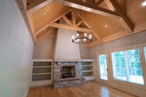
I took the same approach in the great room, allowing the existing character of the room to shine. Repainting the walls in Sherwin-Williams’ Agreeable Grey (SW 7029) helped brighten the room. And some classically styled sconces added a level of elegance. The new hardwood floors also went a long way toward updating this space.
The dining room and study were simply a matter of repainting and adding new lighting.
In the laundry room, I played with the room layout a bit to increase functionality.
The washer and dryer had been on the right side of the room. That put them right in the way of anyone walking toward the bathroom. So I shifted them over to the left, along with some cabinets. Now, there is a clear path and the space feels more open. I also added some new ceramic tile flooring to freshen things up.
A HOMEOWNER’S SUITE THAT WOWS
Whoever ends up buying or renting this home is simply going to fall in love with their first-floor suite, with its own sitting area and patio retreat.
Let’s start with the sitting area. Fresh paint was really all it took to update this space, allowing the coffered ceilings, custom millwork and double-sided fireplace to take center stage.
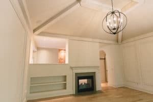
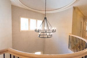
In the bedroom area, I again repainted the walls and added new hardwood floors and new lighting. The result is a lighter, brighter and grand space. A new orb-shaped pendant is one of my favorite finds for this home.
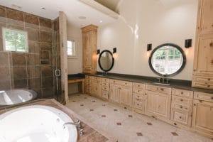
In the bathroom, we stuck to the original flooring, tub and shower. But I thought replacing the countertops, which were kind of a ruddy orange/brown, would help modernize the overall look. The new countertop, a dark grey quartz, does exactly that.
I also removed some upper cabinets and larger mirrors in favor of a more modern and tailored look with painted walls and oval mirrors. And I thought the sconces were a nice addition here. Now, the vanity are has a kind of Restoration Hardware look.
This bedroom suite overlooks a patio that is just to-die-for, so I knew I’d want to give it some attention as well.
That meant I basically just needed to clean up its look. I removed a pergola and non-working hot tub and added some stepping stones and other features. The best part of this space is the waterfall feature that can be viewed outside the bathroom windows.
REMODEL FOR UNIVERSAL APPEAL
In the upper and lower levels of this home, I was able to lean on my experience as a luxury home stager and find the right balance for upgrading the space.
These two floors were just as grand as the main floor, but highly personalized and decorated to the tastes of the prior homeowner.
I knew that if the new owner wanted a good chance of selling or renting the space, he’d have to find ways to tone down the look and find a design that has more universal appeal.
So the first step was taking down all of the wallpaper, which was more dated, and quite simply felt like it belonged to someone else (because it did!).
The kids’ rooms had various themed wallpaper that was cute. But it definitely wouldn’t work if the new family moving in has older kids or wants to use any of those spaces for guest rooms. So I went with a soft grey paint color instead, which immediately helped neutralize the space.
I took the same approach with the bathrooms, swapping paint for wallpaper and in some cases making updates to tile or countertops. But overall, the changes were mostly cosmetic.
So it wasn’t a ton of work, but the impact was big.
Now, when you walk through these two floors you can focus on all of the amazing things they have to offer.
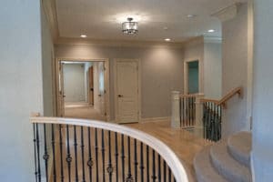
On the second floor, there’s a common space and wet bar that is central to all of the bedrooms. What had been desk space off of that common area is now a second laundry room, which is perfect if someone wants to sit and watch TV while doing their laundry. Included among the bedrooms is an oval shaped room that packs a lot of whimsy in its curved walls.
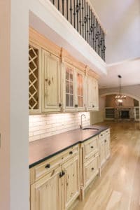
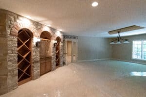
And the lower level is an entertainer’s paradise. It includes a wine bar and home theater, and several bedrooms that could work for guest rooms, play rooms or even fitness areas.
MORAL OF THE STORY
So that brings me back to the lesson I relayed at the start of this blog post: no matter how grand the home, there’s always room for updates!
I expect the work we did here is going to directly translate into a higher selling price on this home. And I have a hunch this one is going to go quickly now that it has benefited from a designer’s touch!
Not only that, but these upgrades will make the space more enjoyable for whomever decides to live there next. And that is a very rewarding feeling for me as an interior designer.
As always, I hope this gave you a better sense of how an interior designer might be able to help you with your home, whether the upgrades are for you or for a future owner. Make sure to check out my Facebook page for more Before and After photos of this project!
And remember, I am always looking for new and exciting design opportunities. So if you are considering a remodel or are building a home, please feel free to reach out!
