There are some design projects that I can’t stop talking about – especially when they involve custom treatments that allow me to really showcase my strengths as an interior designer.
In my last blog post, I introduced you to one such project with a long-time client. Because this one is too good to shortchange, I’m back with another blog post to delve into more fun design details from this gorgeous home.
As a refresher, I first worked on this home when the couple bought it about 25 years ago. Now, with their kids grown and their tastes evolved and refined, they were looking for a refresh. I was happy to oblige.
The goal was to marry the more traditional structure with the wife’s contemporary tastes. Think “modern traditional.” Believe it or not, that’s a thing! While it may sound like an oxymoron, it is a beautiful design style that is simply timeless. And that’s what we ended up with here.
I took you through some of the gorgeous kitchen details in our last blog post, along with some floor plan changes that opened the home to entertaining. So now I want to talk about some specific design choices and custom treatments that we were able to incorporate in other spaces.
Let’s start with the breakfast room just off of the kitchen. I have been so excited to share the fun design decisions that brought this breakfast room table to life.
Can’t Find it? Make it!
We were looking for a 54-inch round table for this space, and the homeowner wanted something beautiful but durable. Well, if durable was the goal, the usual wood or glass top wouldn’t cut it. We needed to find something she would never have to worry about.
Because I’ve known the clients for quite some time, we decided a little trip to market was the perfect place to start our hunt. So we planned a visit, and sure enough, there we encountered the perfect piece. Well….almost perfect.
We found a beautiful table with a resin base that resembled wood, and it was just the right size. But it had a glass top.
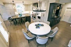
Dead end? Not with this designer! I learned we could purchase just the base form Caracole. So I suggested we take a small design leap and try to get the top custom made ourselves.
We ended up using the same quartz that we had on the countertops, and this allowed us to create a really luxurious and cohesive look but with the durability that client was craving.
It meant taking a risk, because there were a lot of details that had to be coordinated just right to make it work, including using a plywood substrate, a 2 cm stone and having the edge finished with a furniture look.
We added some custom chairs with a performance fabric from Vanguard Furniture. Durable yet beautiful – that was definitely our theme for this table! And it’s something I’m hearing more and more from clients. Homeowners want a classy look, but they also want it to last. If you work with a designer who is willing to take the extra steps to give you a truly custom design, you can have both.
Going the Extra Mile
Now onto one of my favorite rooms in the house: the family room.
The reason I love this room is because it really demonstrates how we went the extra mile to get that custom look.
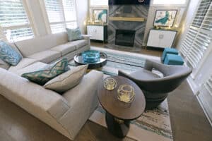
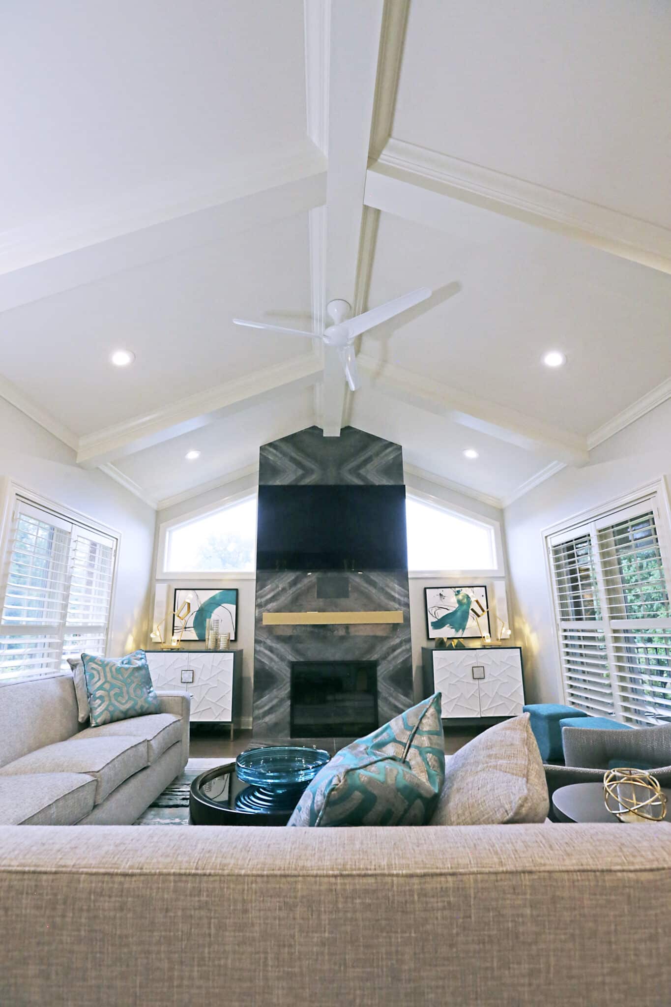
First, feast your eyes on the hearth. While it looks like stone, that fireplace surround is actually made of 24 x 28-inch porcelain tiles that are bookmatched to create a seamless pattern. The goal was to mimic how a slab would look freshly removed from the earth. Can we all say “WOW” in unison?!?!
(We even continued the tile on the sides where the firebox projects slightly into the room. This is the “extra mile” that I’m talking about!)
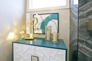
We then added two custom chests from Century Furniture to flank the fireplace and hide the tv components. The leather pearl hardware and teal exterior that we chose for these two pieces adds some glamor to the room.
Custom Color
Taking the design even further, we commissioned the artwork above each chest from a company called Art Classics. They’ve come up with a great concept, allowing you to submit a paint chip to have any of their art pieces made in whatever color you choose! It was a must for this custom project and I am so pleased with the result.
Again, custom treatment for a very special home!
The rug you see in these pics? Also custom designed for this project. I use a company called Davis & Davis that, like Art Classics, allows you to handpick the colors and style you are seeking. I have a big ring of yarns in my office, and will pick the colors and patterns that I think would work best for any given project, then I send a few options for my clients to pick out.
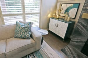
That’s how this rug came to be, pulling in those teal accents oh-so-perfectly!
Finally, take a look at those speakers on both sides of the tv. Don’t see them? That’s the whole point!
I was working at the house one day when the speaker company was also there, and we were having trouble finding a place to mount the speakers where they wouldn’t be an eyesore.
Well, turns out the company was able to have the speakers made in a color and shape that I thought would work with the project. On a quick glance, it looks like abstract sculptural art on the wall! (Now do you see them? Look closer at those tall, white rectangles).
This was making the best of a tricky situation and I am so pleased with how it turned out.
Next Up
As you can see, we really poured a lot of thought and extra detail into this project. And I’m so excited to say that we’re not done yet! The clients are interested in having me next work on their great room, dining room and front entry. And still to come is the primary bedroom, which could end up being a gut renovation, which is always a fun design adventure.
I promise to share more about those projects once we get to them!
As always, don’t hesitate to reach out if you’d like me to bring some custom design touches to your home.

