Some people know exactly what they want in a home.
They will house hunt with a mix of vision and intuition, searching for the perfect canvas – a space that can easily be adapted to all they want and need it to be.
I recently worked with a client who fits this description perfectly.
Looking to downsize, she searched on and off for several years for the ideal home that could give her the right mixture of amenities and open space.
She wanted a park-like setting, a three-car garage, a first-floor master bedroom and large closets.
When she finally found THE ONE, she called me to transform the house into the dream home she envisioned it could be.
As a designer, I always put a lot of care into all of my projects.
But when I know a client has been patiently searching for years — and has finally found the ideal space to work with — I feel an even deeper desire to bring their vision to life.
In this particular case, I had worked with the client in her previous homes, and had the pleasure to watch her personal taste, style and needs evolve over the years.

Because of this long-term relationship, I was all the more committed to make her new home everything she dreamed it could be.
The new home in Weldon Springs had an open concept floor plan, which was one of the things she loved most about it.
Making the Old New Again
She wanted to work with many of her existing furnishings, a choice that presented a bit of a design challenge because she wanted a more casual feel and brighter color scheme than in her previous homes.
Fortunately, by reworking some of the pieces and rearranging others, we were able to create a fresh look she loves without sacrificing the items she wanted to keep.
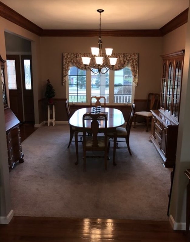
In the kitchen and dining rooms, you’ll notice that the same chairs from her previous home were re-purposed – and look completely different in the new space!
The Kitchen Makeover
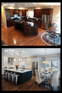
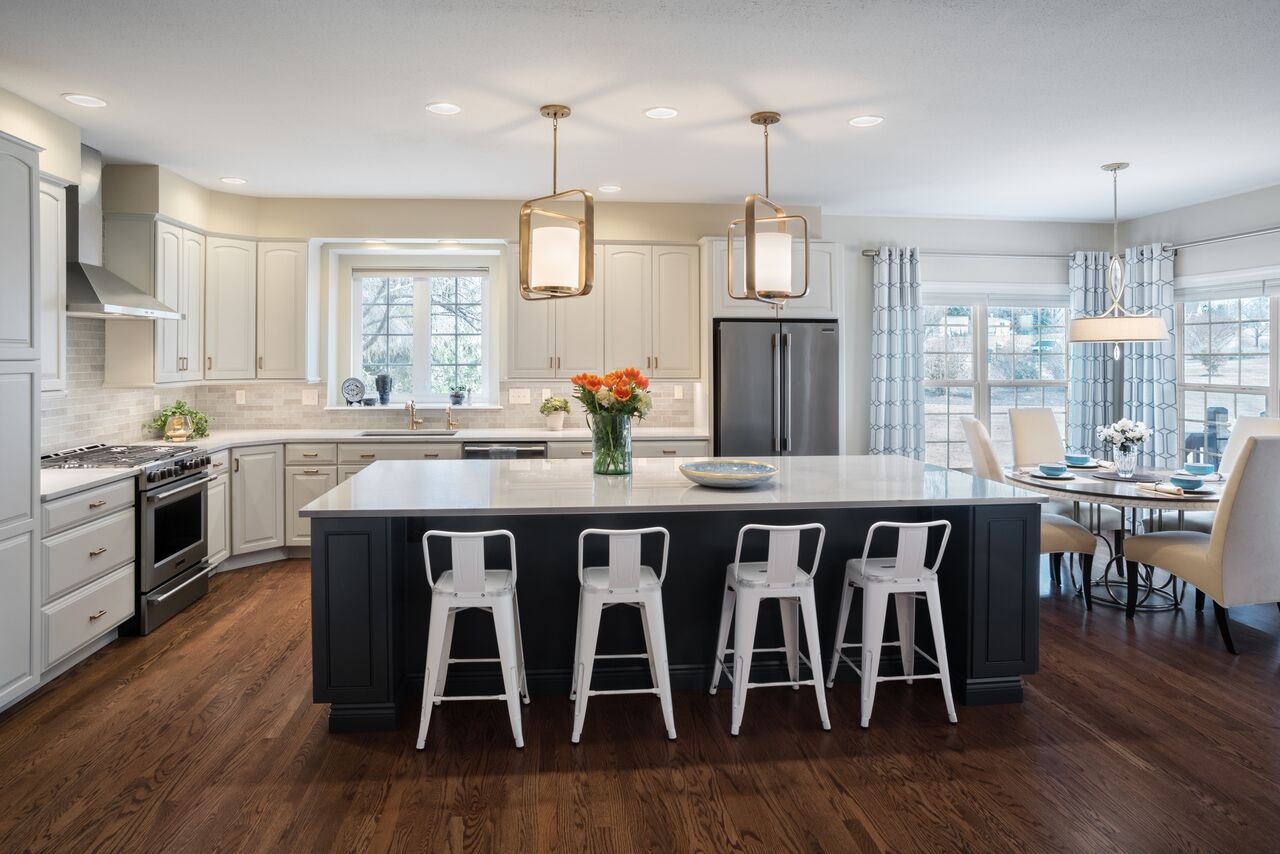
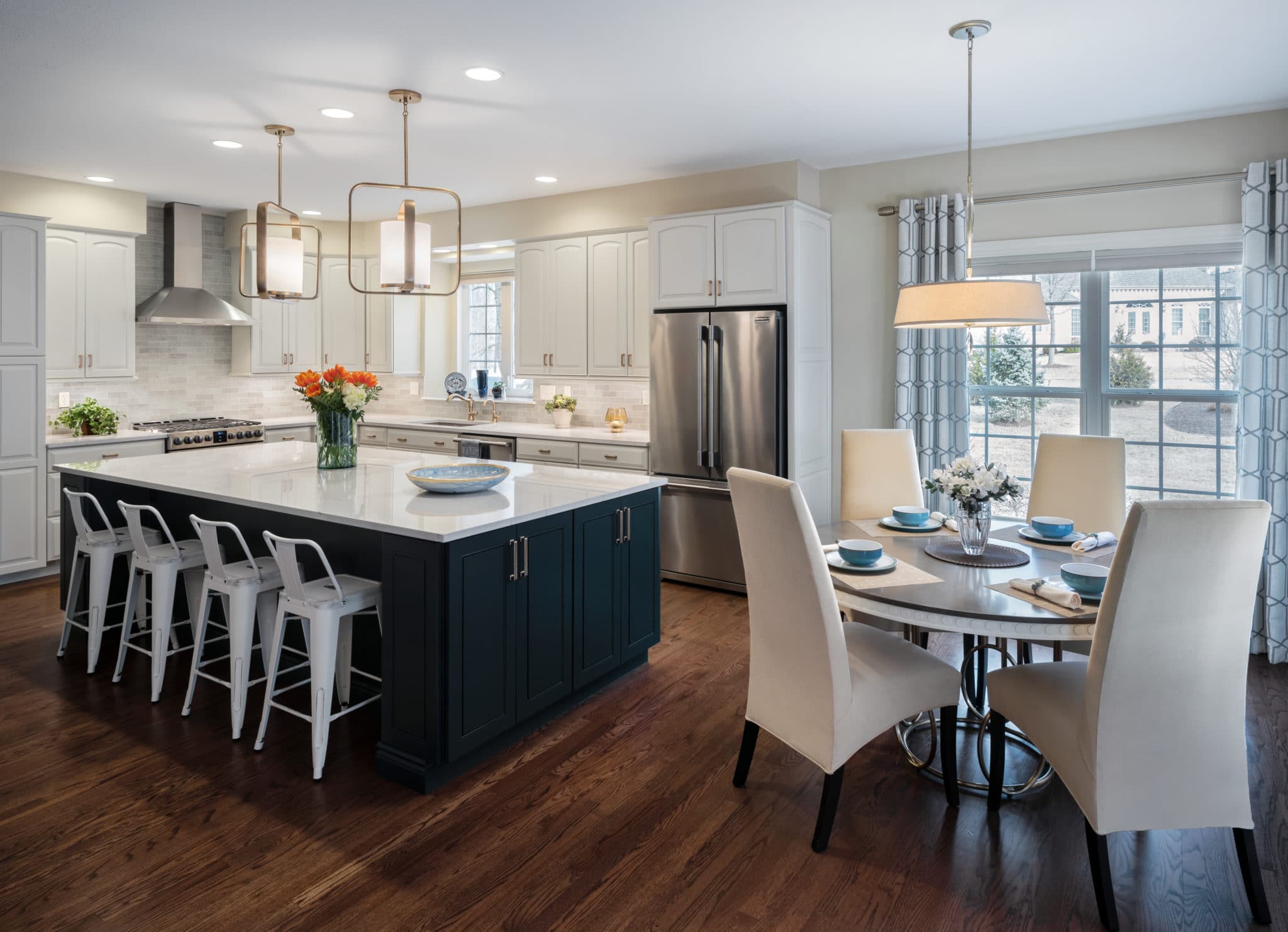
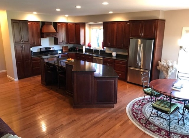
The kitchen itself was completely transformed in our remodel project.
You can see from our “before” and “after” pictures that the whole space now has a lighter and more airy feel.
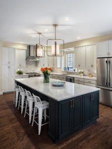
The first step in accomplishing this was painting the existing cherry wood cabinets a bright white.
We carried this crisp look through to the countertops, which are an Ella marble from Cambria, and added white metal stools, for a more informal touch.
The walls are more of a creamy white, and the backsplash, from Premier Tile Corporation in St. Louis, pulls together these different shades.
To balance out all the white, we chose a rich blue paint for the island. The blue is repeated, but softened, in the window treatments.
New hardware and pendant lights from Kichler update the look, as does a new, sleek kitchen hood.
Because we were working with an open floor plan, it was important to establish continuity with the other areas of the home.
The Great Room Refresh
So we carried the kitchen wall color through to the Great Room and went with a blue wall paint in the dining area and study, to tie in with the kitchen island.
We took white paint to all the dark wood trim, and installed new hardwood floors throughout.
The floors were stained a rich, medium brown to help anchor the space and provide contrast.
Rearranging the accessories and pictures in these other rooms went a long way toward updating the space, and plantation shutters were a nice upgrade for both the study and dining area. New fixtures from Capital Lighting were also added.
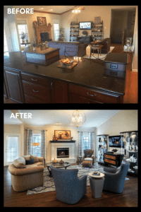
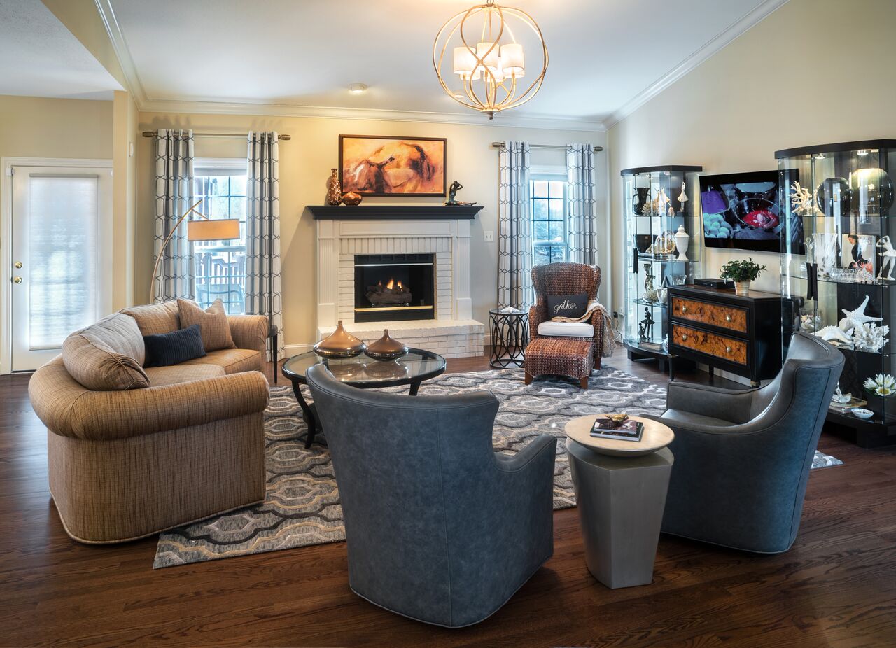
For the Great Room, we painted the hearth white (the brick felt a bit dated) and added a new couch and two leather swivel chairs that bring in some more of that dreamy blue.
The area rug, from Jaunty, combines the blue with some of the brown tones that also appear in the room.
The Dining Room and Study
The new dining room uses some of the same chairs that you see in the kitchen. Not only does this add to the flow from room to room, but their elegant frames pair wonderfully with the more understated table that they surround.
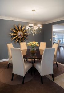
Keeping the lines simple allows the eye to focus on the mirrored wall hanging, which is a stunner.
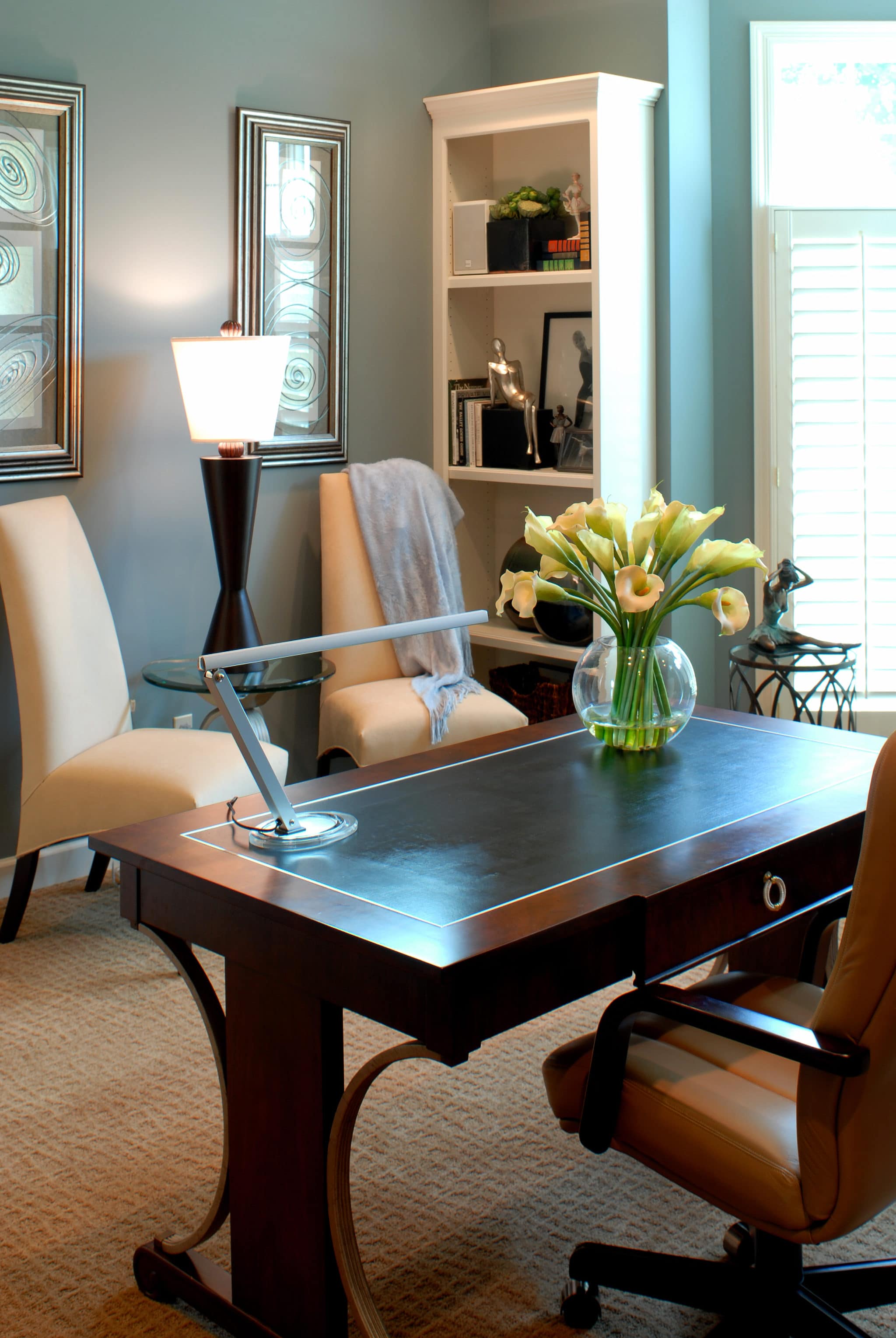
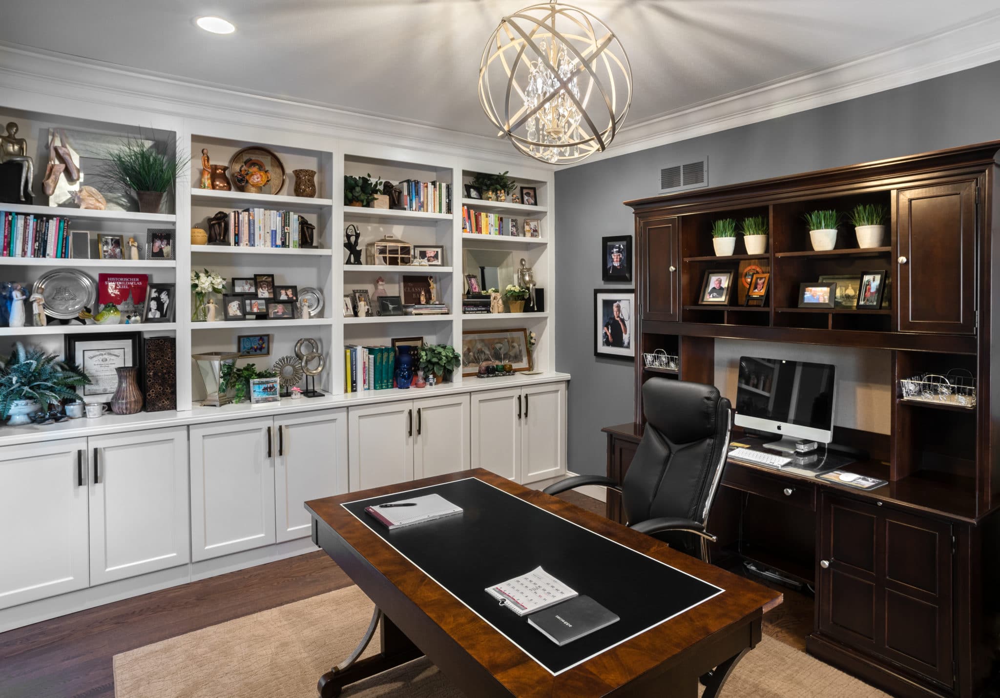
The study is a streamlined space where she can work, or settle down to read.
None of this work would be considered an overhaul, in the technical sense. We didn’t tear down any walls or build anything new.
But by tastefully combining new furnishings with old, and brightening the entire look with new fixtures and paint, we completely transformed the space.
In many ways, that’s even more satisfying than building a dream home from scratch.
Remodeled Study.
Remodeled Great Room.
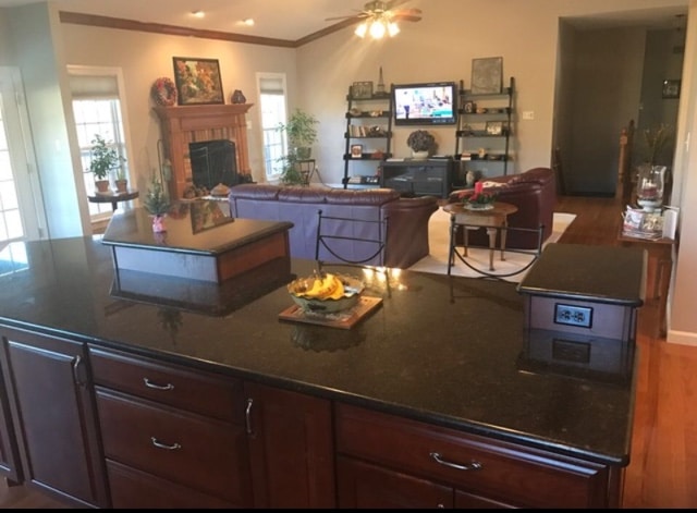
BEFORE photo of Great Room.
Redesigned dining room.

BEFORE photo of dining room.
Remodeled kitchen.
Remodeled kitchen.
BEFORE photo of kitchen.
Previous home for same client - note the chairs.
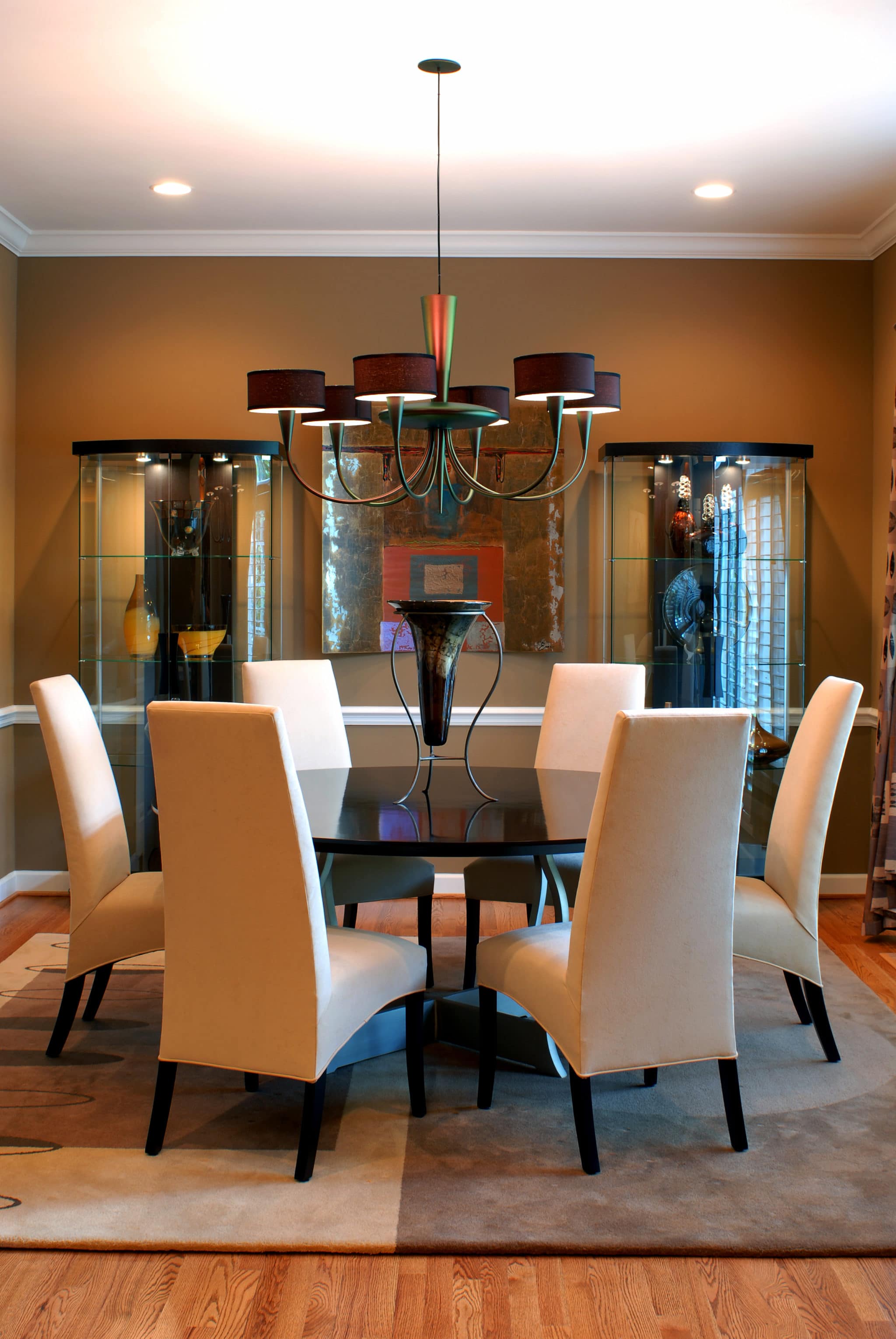
Previous home for same client.
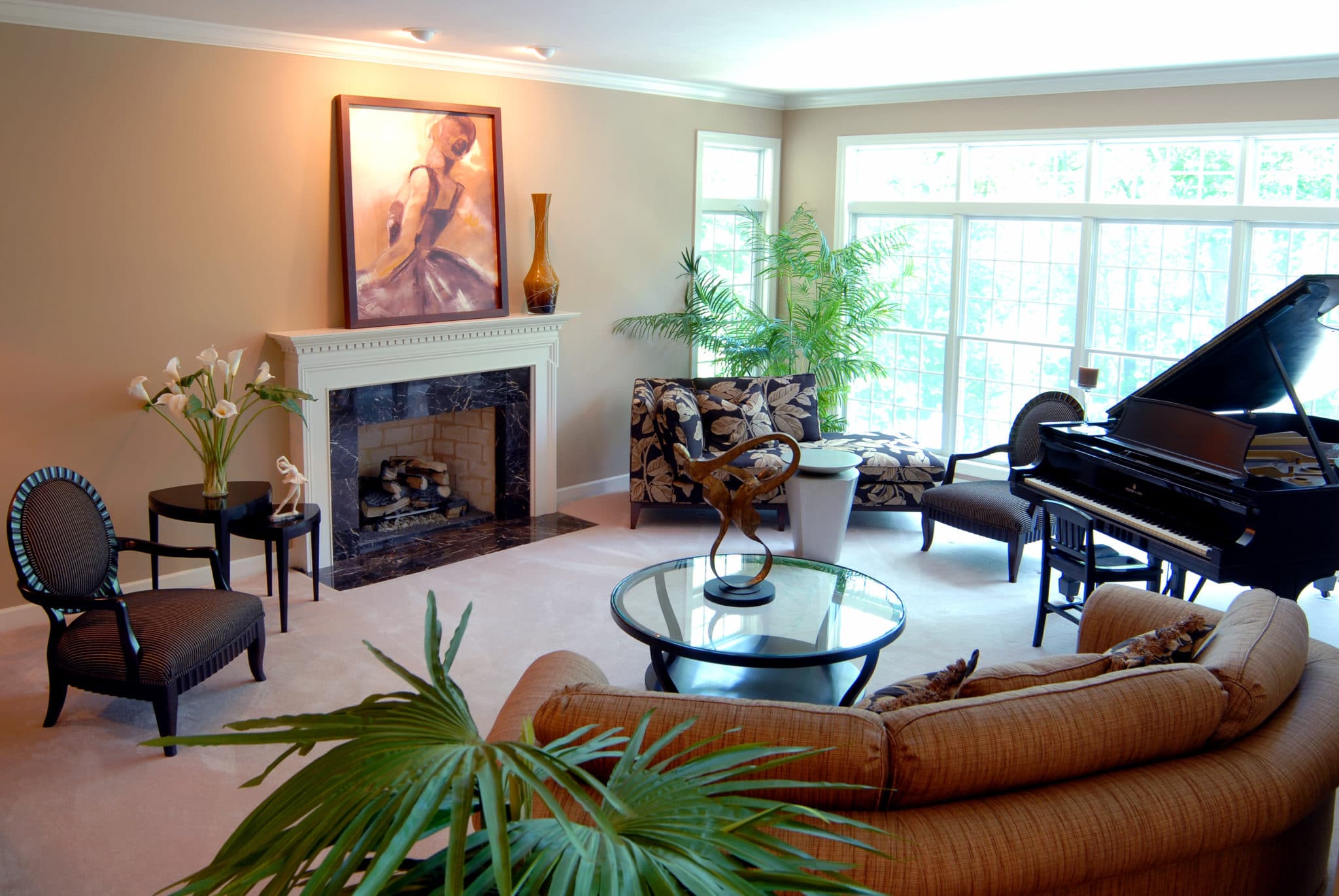
Previous home for same client.
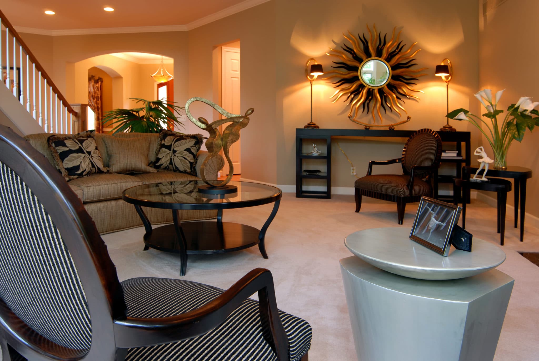
Previous home for same client.
