You know those Choose Your Own Adventure books that allow a child to chart their own course through a story? Well, I like to think of a renovation project as a grown-up version of that. Because there’s no single, set outcome or path when remodeling your home. It’s a matter of finding the plan that is best for you and your budget, schedule and lifestyle. And that’s unique to every individual!
You could choose to go all out and overhaul the space. Or you could change just a room or two. You could plan it all out in advance. Or maybe you take it as you go, seeing what changes you crave as the renovation progresses.
To me, this is what makes the interior design process so fun and dynamic. Because every client has their own preferences and their own ideas. And in helping to steer them along, I get to enjoy the adventure alongside them.
So do you want to hear about one of my more recent adventures? Good! Because I’ve been eager to share it.
A Lighter, Brighter Look
The clients hired me to help renovate the home that they had bought at the Whitmoor Country Club in St. Charles. They were empty nesters who were downsizing. And they had found the perfect location, right on a golf course.
The house had a very traditional feel and appearance — cherry floors, wood trim, beige walls, and furnishings to match.
The clients wanted a significant shift in the look. Their vision was to give the home a lighter, brighter and more current feel. But they didn’t have the appetite for a major, structural overhaul.
That said, they were interested in making layout changes on their lower level, where they planned to invest the majority of their renovation dollars. This is a space where they planned to do a lot of entertaining. So it was important that we made it both comfortable and sharp looking.
I helped them achieve those goals, one design decision at a time. In the end, we didn’t touch every room in the house, but we did make changes in many of the rooms. And with some broad brush tactics — such as repainting the walls and trim, and staining the floors on the main level — we were able to create big change but with less impact on the project budget.
Let’s take a closer look.
Moving from Old to New
Some clients will choose to devote most of their renovation time and money on the kitchen, given its visibility and heavy use.
But this couple looked at their home and realized the kitchen could be updated pretty easily (and economically) with just a fresh coat of paint on the cabinets. So they went ahead and painted the cabinets themselves before I even came on the scene.
That allowed them to set the kitchen aside as a room they might revisit at some later point. And that gave them the freedom to focus on the rest of the house.
I was excited to help them with this broader renovation focus.
The home has a semi-open floor plan — in other words, while it’s not open in the traditional sense, there is a fair amount of flow and visibility between rooms. So it was important to have a cohesive look as one travels from room to room.
With that in mind, I started in the dining room, which is just off the kitchen and leads to the great room.
Dining In Style
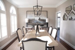
Here, as with the rest of the first floor, a fresh coat of paint on the walls and trim instantly brightened the space. The wood-stained trim that had been there was just a little too dated for the look they were seeking. And now, those arched windows can shine.
We also added plantation shutters to all of the windows. These are becoming increasingly popular as people seek to update their look but still maintain privacy.
And while they are a new touch, they have a timeless appeal, which helps blend the renovation into the existing home.
We kept the light fixture that was already there, but I brought in a new table and chairs set from Hooker Furniture.
The color palette is a creamy, dreamy neutral, and I kept the lines and texture of the accessories very simple here. Sometimes less is more!
The stairwell between the dining room and great room leads to the lower level. Given how visible it is, and the fact that it connects to a major focus area for our renovation, I wanted to make sure we gave it some love.
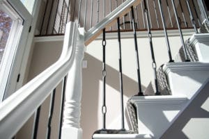
So I had the carpenter pay some extra attention to the different components of the stairwell.
We cut off the finials and added some subtle detailing around the square profile that remained. And we swapped metal balusters in place of wooden ones, for a more modern look. The knotted detail on the new balusters is one of my favorite elements of this new space!
I also selected a new runner to complement the fresh color scheme of the home, and to add just a touch of texture.
Traditional Turns Transitional
In the great room, we again attacked the wood trim wherever we could find it. Out with the old, in with the new!
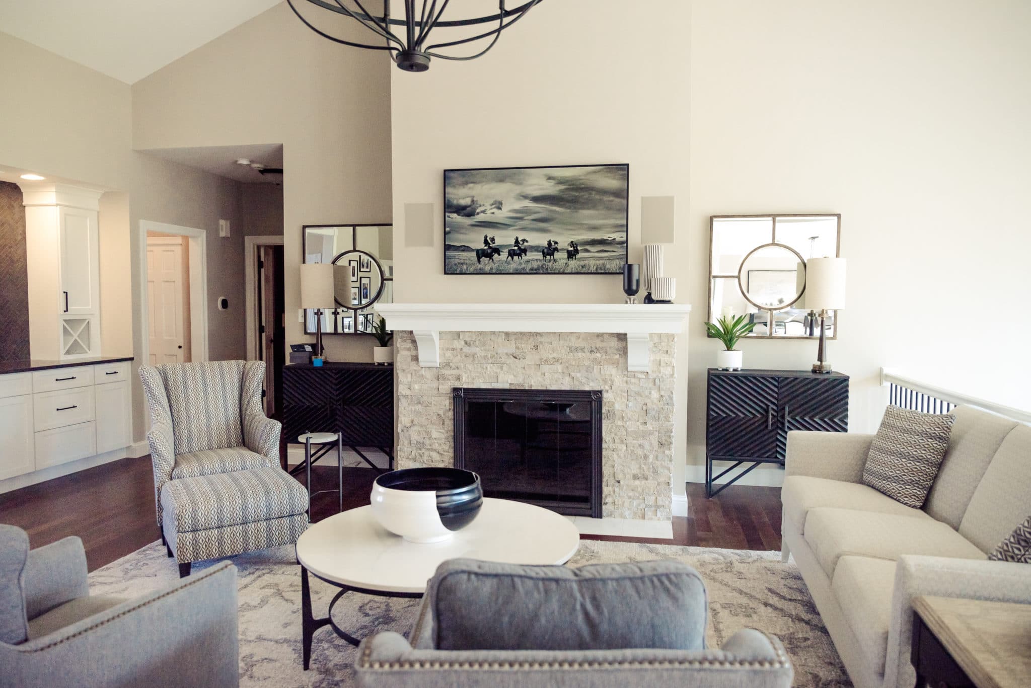
This made a major difference for the fireplace, which had been a more traditional, heavier piece in the room. With a new stone surround and white painted mantel, it now looks fresh and modern. And in removing the huge wooden mirror in favor of painted drywall, we created space for one of the highlights of this room — a frame tv!
In just glancing at this, you’d just assume that it is a beautiful piece of artwork. But not so! It has function, too, and many channels to surf :). And when we can combine beauty with function, I am a happy designer.
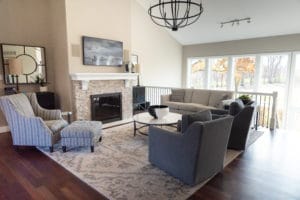
The furniture here is from CR Laine and Bernhardt, and the rug is from Jaunty.
I played with patterns and texture in the armchairs and throw pillows. And as for the color palette, I went with soothing blues and cream colors, in place of the deeper red and gold tones that were in this room previously.
And speaking of red, one subtle but impactful change that I made in this room and elsewhere on the main level? Adding a greyish black stain to the brazilion cherry floors. The existing floors were just a little too red for the vibe we were looking to convey/capture. The cooler stain tones that down beautifully.
The clients had debated leaving the little bar area untouched, but after we saw how the rest of this space was shaping up, it became clear that it would need updates as well. So we replaced the cabinetry — opting for a tailored, white look — installed some crisp, dark hardware, and backed it all with a chevron-patterned tile. While it was a bit of an afterthought, this bar area ended up a stunner!
Finally, in the foyer we replaced the hardware on the front door and once again used our paint brush liberally for an overall fresh and updated look.
Bedroom Bliss
In this home, the owner’s suite and guest bedroom are on the main floor. So it was doubly important to make our design plan cohesive, and to carry the general look through to the bedrooms as well.
The guest bathroom, in particular, needed this approach because it also gets use from the other areas of the house. So here, we stripped the red floral wallpaper, which had a more old-fashioned look, and went with a neutral grey wall color instead. We replaced the vanity (white instead of wood) and went with a smaller mirror, to make the room feel less crowded. And we replaced the tub with a new shower with some beautiful tile work, to help elevate the space.
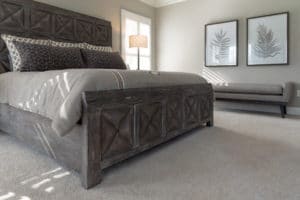
In the guest bedroom, we added new carpet and paint. And in the owner’s suite, we did the same.
I also helped furnish the owner’s suite, with a beautiful distressed grey bureau from Hooker, and a bed frame to match. I added a little texture and movement with the pillows. And with the bench at the side of the room, we created a nice little place to rest or put on shoes.
The end result is a restful and tasteful space that can be easily updated or modified as this couple continues to live and grow in their home.
Stay Tuned for Part Two
So that’s the first floor renovation! Of course, there is a lot more to see in this home. The lower level was a huge transformation on its own and I’m really proud of how it turned out. So I will give that area its own space on this blog. So stay tuned for more on this project! And as always, if I can help you with your next remodel or new home, please give me a call!

